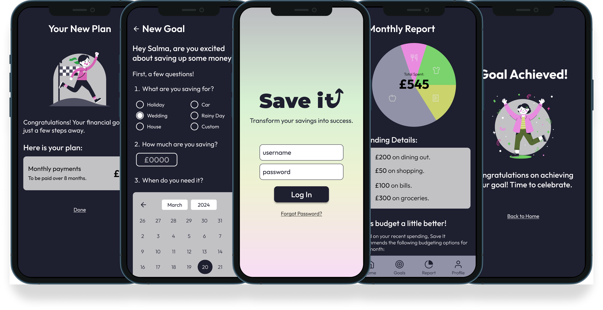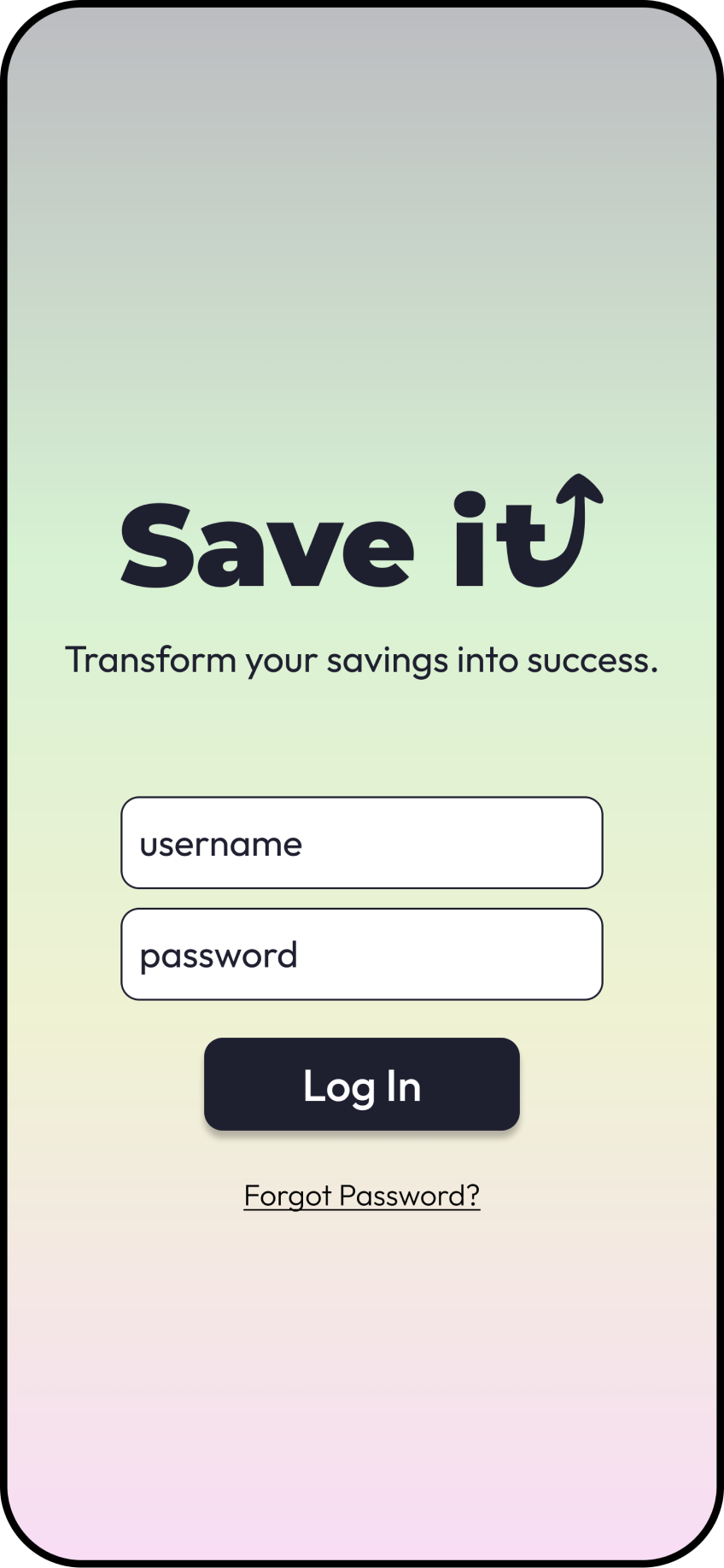
Transform your savings into success.
UX/UI Case Study
Project Scope
To design a money saving app that motivates its users to save money through a personalized experience, allowing them to set goals and achieve milestones while having an overview of their spending.
Brief:
Saving can be difficult, intimidating and overwhelming. Many people struggle to start and can be pushed even further away by complex financial jargon.
Problem:
An application made specifically for those who struggle to save, including personalized advice, simple interface and encouraging copy.
Solution:
Tools Used:
Balsamiq, Figma, AI (Board of Innovation)
User research, user journeys, wireframing, usability testing, branding, design system, prototyping.
Process:

What motivates people to save money? How can technology encourage a positive outlook on financing?
Interviews
With the help of AI, I created an interview script aimed at understanding what motivates people to save money, and what they look for in their money saving applications.
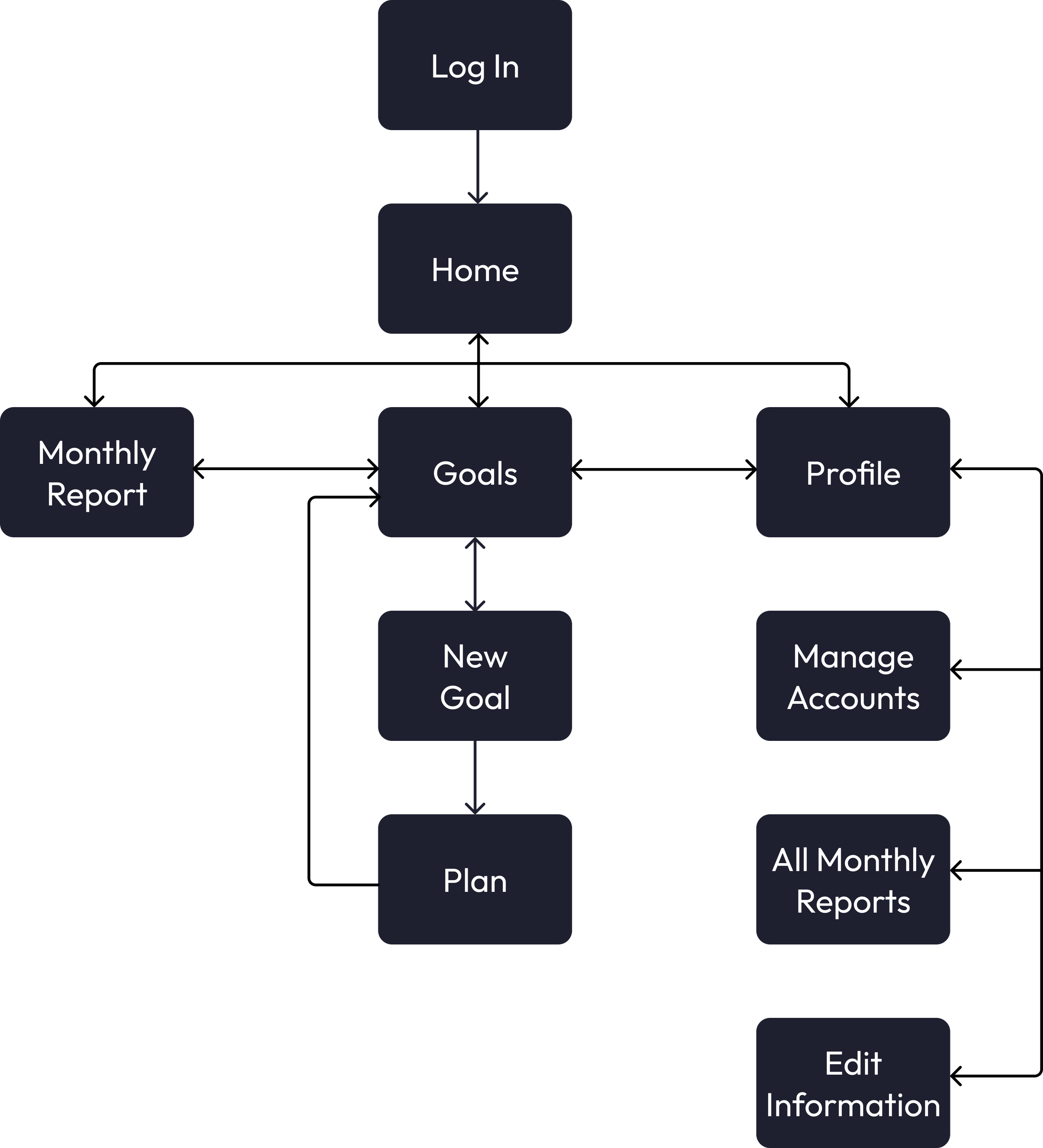
User Flow
After understanding user needs, I began mapping the user journey. With three main flows, I made sure that each path was simple, easy to understand and motivational.

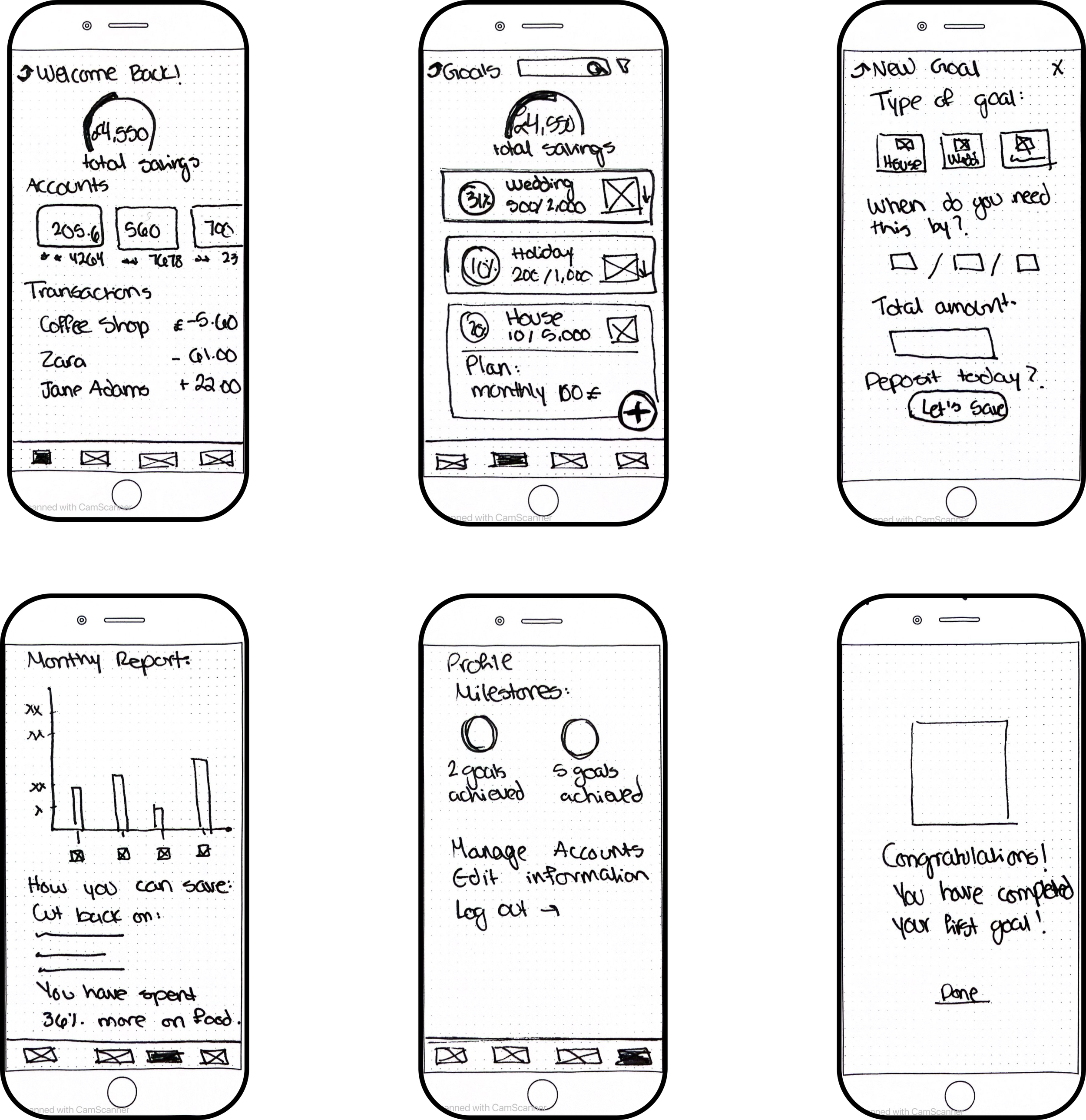
Starting with pen & paper…
Low Fidelity Wireframes
Bottom navigation bar for ease.
Graphic representation of finances.
Connecting multiple bank accounts to one application.
Easily trackable goals.
Clear progress levels.
Motivational text.
Personalized data & advice.
Achievable milestones.
Key Elements:
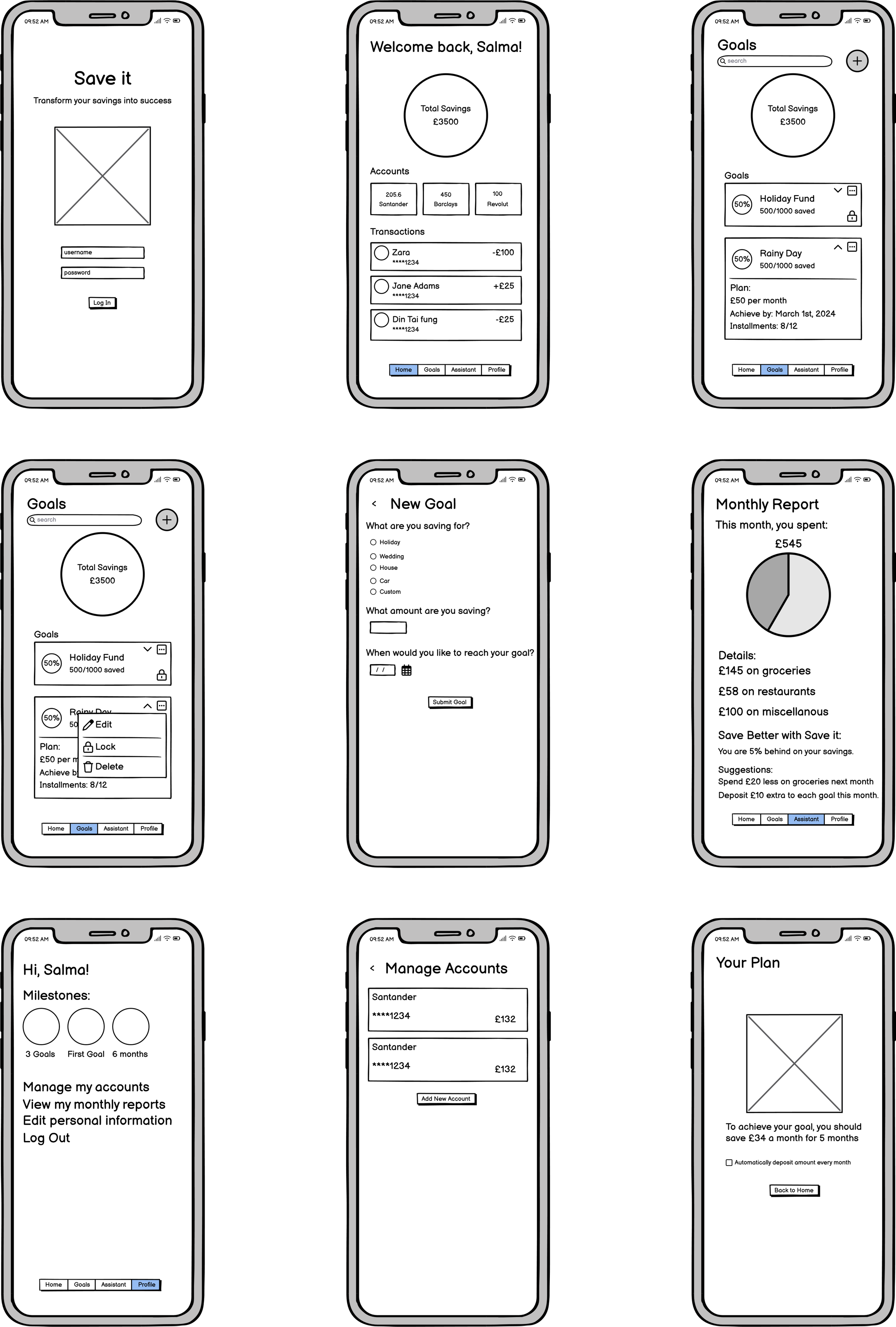
Mid Fidelity Wireframes

A feedback driven cycle…
Usability Testing
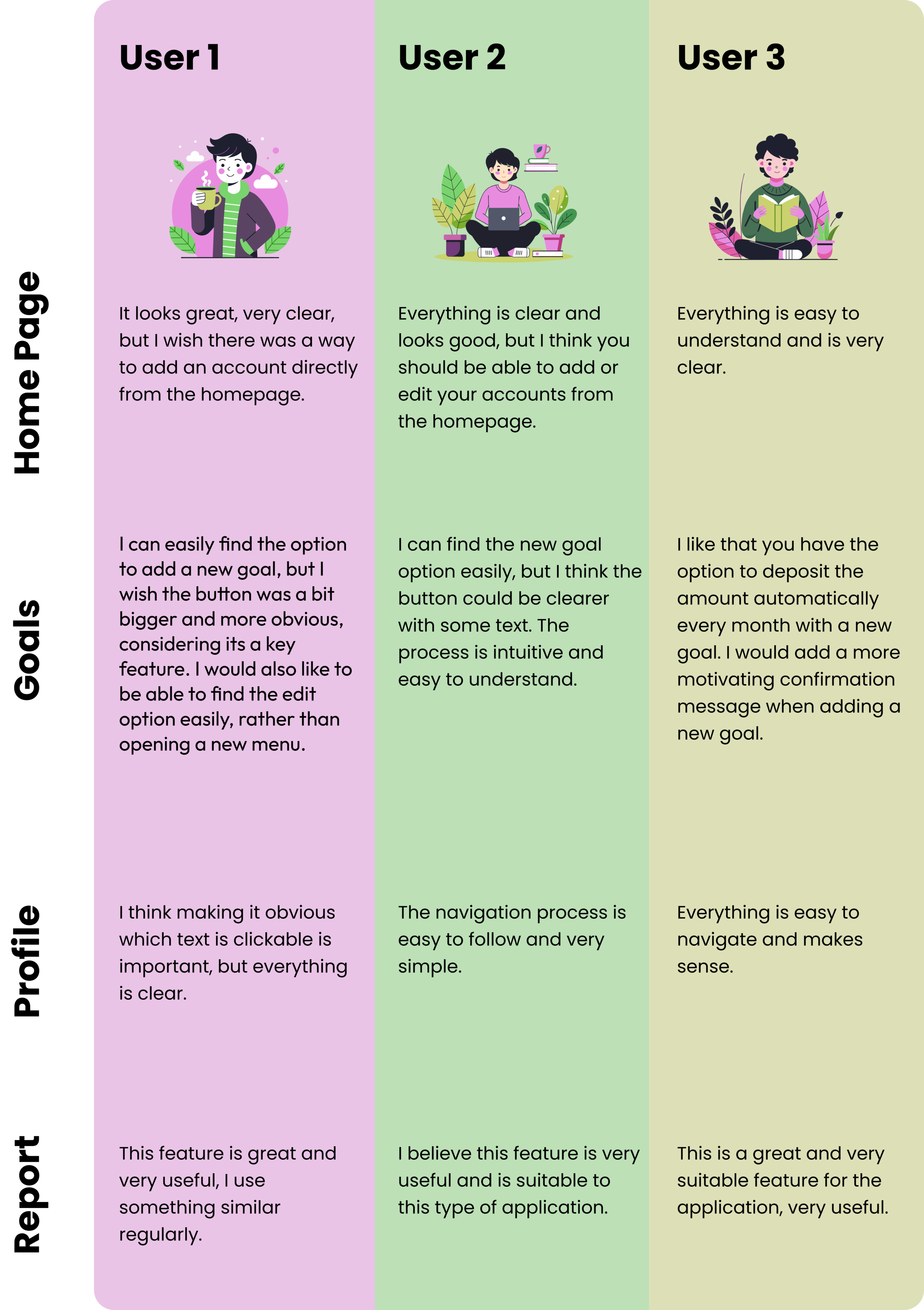
Using a prototype made with mid-fidelity wireframes, I conducted a usability test with three potential users. I asked them to create a new goal, edit a goal, add a new account. Additionally, I conducted a preference test regarding the monthly report, with a unanimous vote on the personalized reporting style.

Ensure users are able to manage/add accounts from homepage.
Make “add new goal” button more obvious.
Make text more encouraging.
Ensure strong text hierarchy throughout all screens.
Make it easier to deposit money into a goal.
Key Findings:
User Interface Design
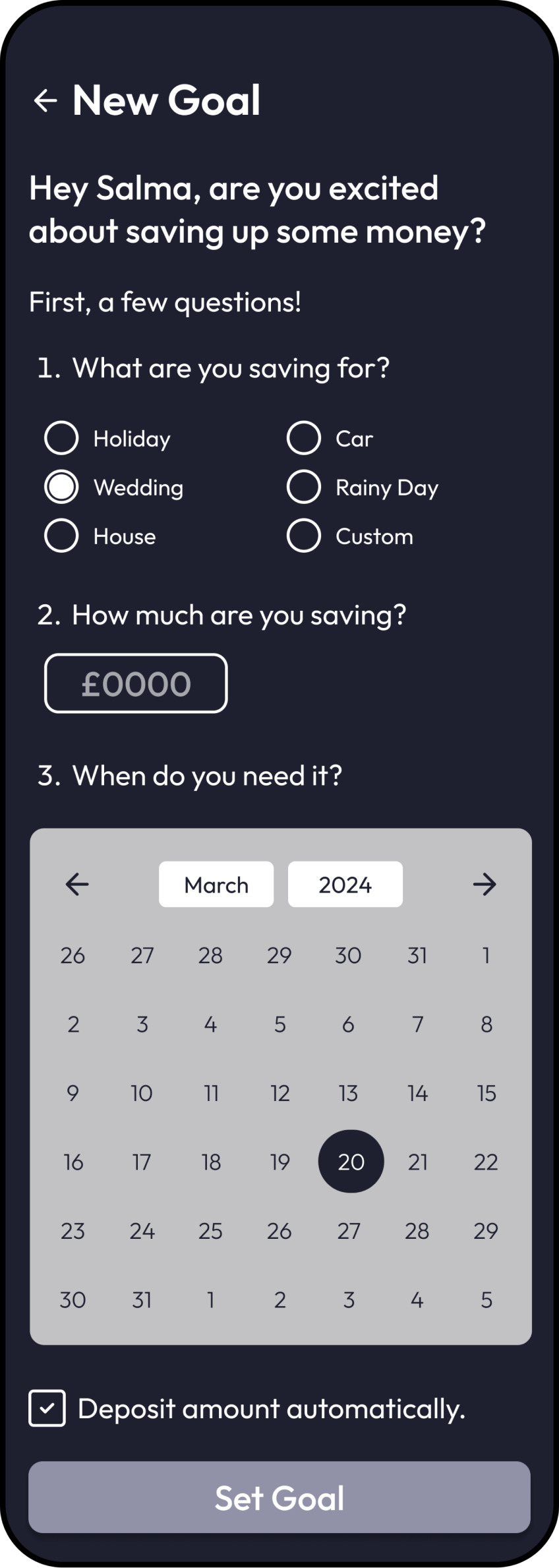
Setting & Achieving Goals
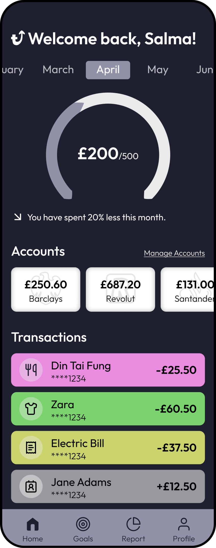
Managing accounts through the homepage.
Categorizing spending with iconography and colours.
Budget tracker.
Being able to quickly deposit money into account.
Easily trackable goals.
Obvious way to set new goal.
Convenient option to allow the application to deposit monthly amount automatically.
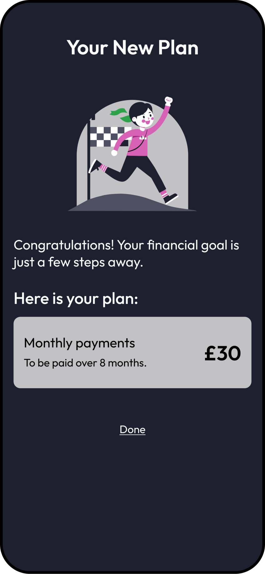
Easy to follow plan.
Managing Accounts
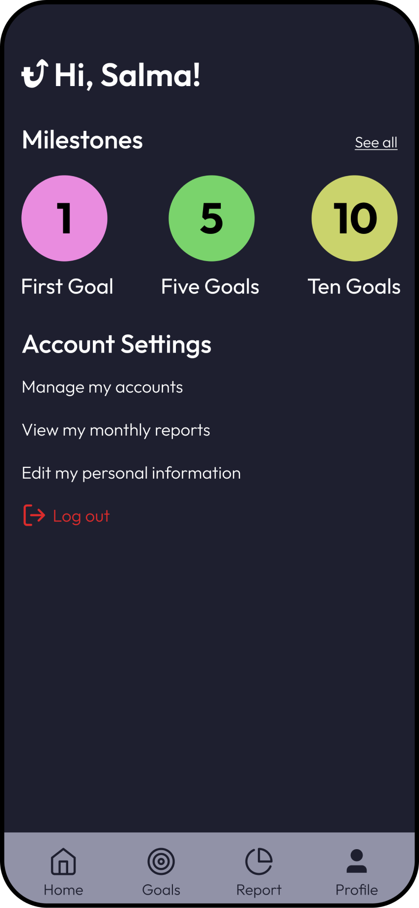
Milestones set to ensure motivation.
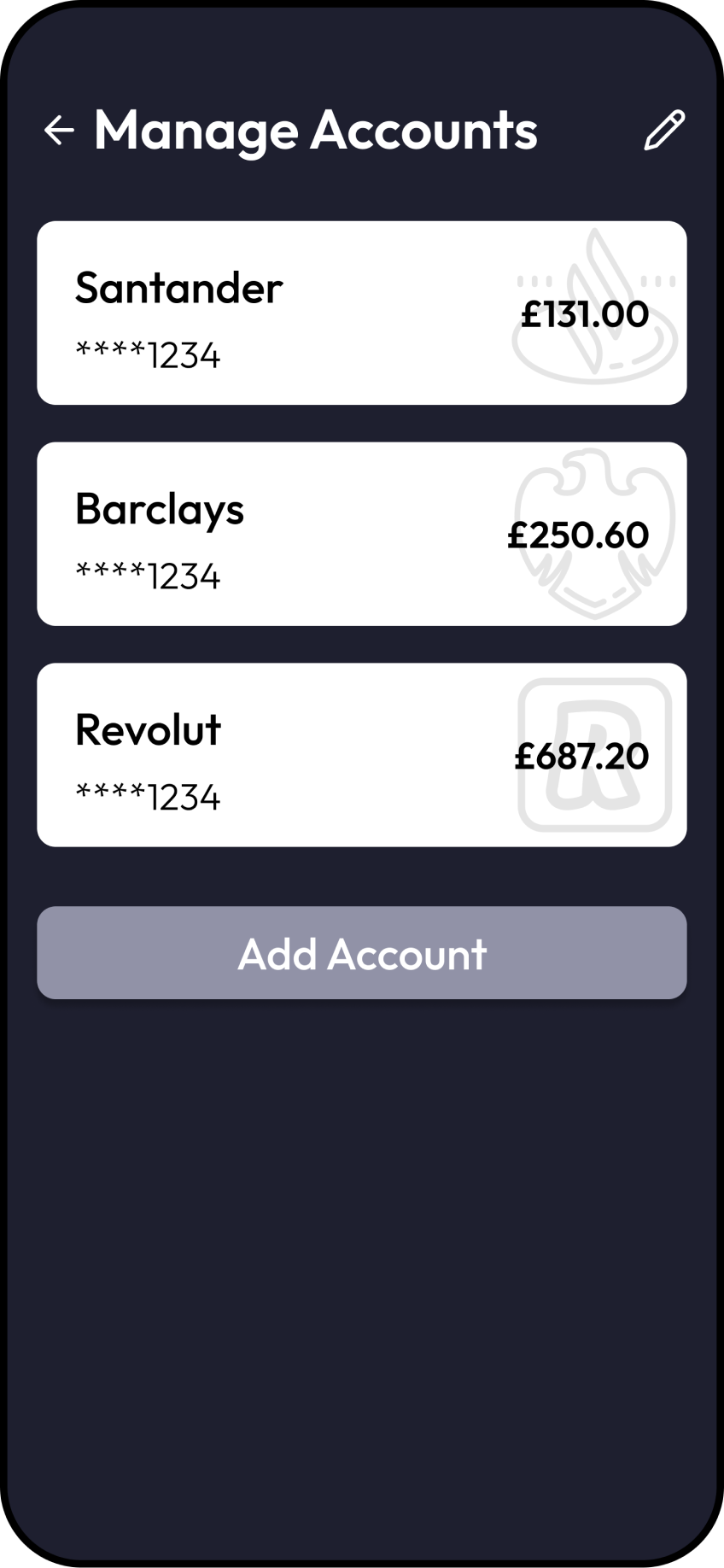
Management of accounts can be accessed in two ways.
Easy to edit and add new account.
Relevant information showcased on main page.
Monthly Report
Spending categorized by colour.
Achievable goals.
Personalized suggestions.
Motivational language.

