mu-zero Hyperloop
Pushing the boundaries of sustainable technology.
Project Brief:
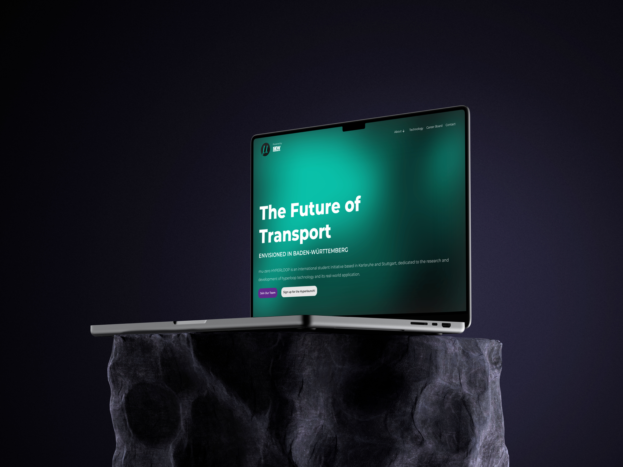
Overview: mu-zero Hyperloop is an organisation based in Karlsruhe and Stuttgart, Germany. They work on the research and development of hyperloop technology, known as the fifth and newest form of transportation, and present a new cutting-edge prototype each year. They aim to contribute to a more sustainable future and pride themselves on their collaboration, working together to push the boundaries of technological advancement. As part of the marketing team, I designed and developed a brand-new website.
My Role: User research, competitive analysis, concept ideation, precedent analysis, high-fidelity wireframes, no-code development.
Tools Used: Figma, Framer, Google Forms, pen & paper.
Timeline: 5 weeks.
The Problem
I joined mu-zero to design a new website for them. The previous version, while it contained all the correct information, was outdated and difficult to navigate. The lack of an intuitive nature for the website caused new-comers to struggle to find the information they needed. Due to the new and innovative nature of hyperloop, the website made it difficult for those unfamiliar to understand the concept, making it inaccessible to the majority of students.
For mu-zero to start the recruitment process, the new website had to find a balance between innovative and practical, and it had to be finished within five weeks, a constraint I had to take into consideration right at the start.
The Goal
The new website had to achieve the following:
An increase of student memberships by giving the organisation a modern, innovative, and inviting feel.
An increase in company sponsorships by showcasing the groundbreaking work done by mu-zero, encouraging companies to invest in their work.
Making hyperloop accessible by simplifying the information, increasing readability, and avoiding too much technical jargon.
User Research: Key Insights
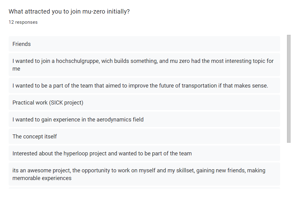
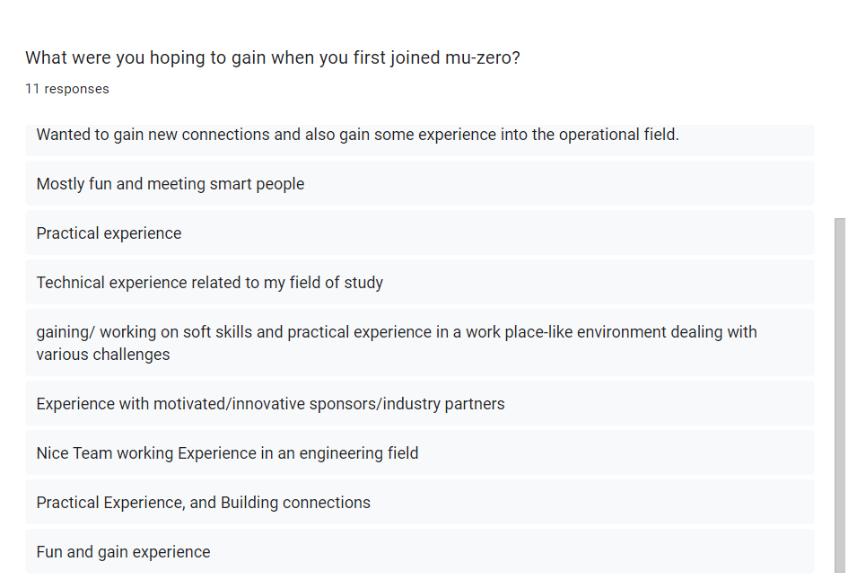
By conducting a survey for 10+ students, and collaborating with the CEO and team leaders, I was able to understand what draws students to join an organisation like mu-zero. What encourages them to submit an application, put in a minimum of 15hrs/week, and similarly, why would students choose not to join?
Students are always looking for new ways to meet like-minded peers.
Students need accessible ways to gain real-world experience and make connections in their desired industry.
Students are fascinated with hyperloop technology and its real-world implications.
As exciting of an opportunity it is, students may struggle to find the time to commit to such an organisation, or they may be unaware of the option to join as a part-time contributor.
Competitive Analysis: Key Insights
I conducted an analysis of three hyperloop organisations, looking into what makes or does not make their website usable, attractive to students, and accessible. These were the key findings:
While websites enticed students with high-resolutions imagery and videos, many of them lacked clarity on where to submit membership applications.
For someone not as well-versed with the concept of hyperloop, the websites made it difficult to be introduced to the subject, mainly focusing on an audience that is already experienced.
Overall, the navigation on each website was simple, making it easy to jump from one content to another.

How might we show students the stronghold community behind mu-zero? How do we make hyperloop technology a simple and exciting concept?
Concept Development
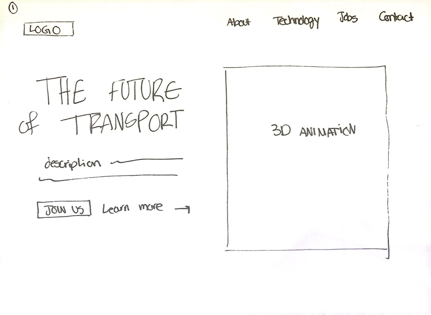
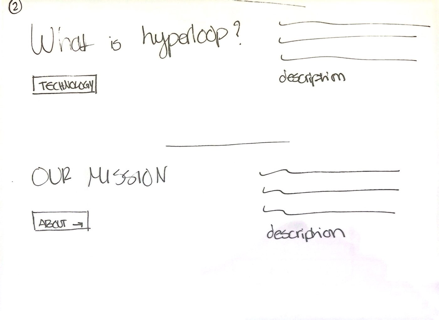
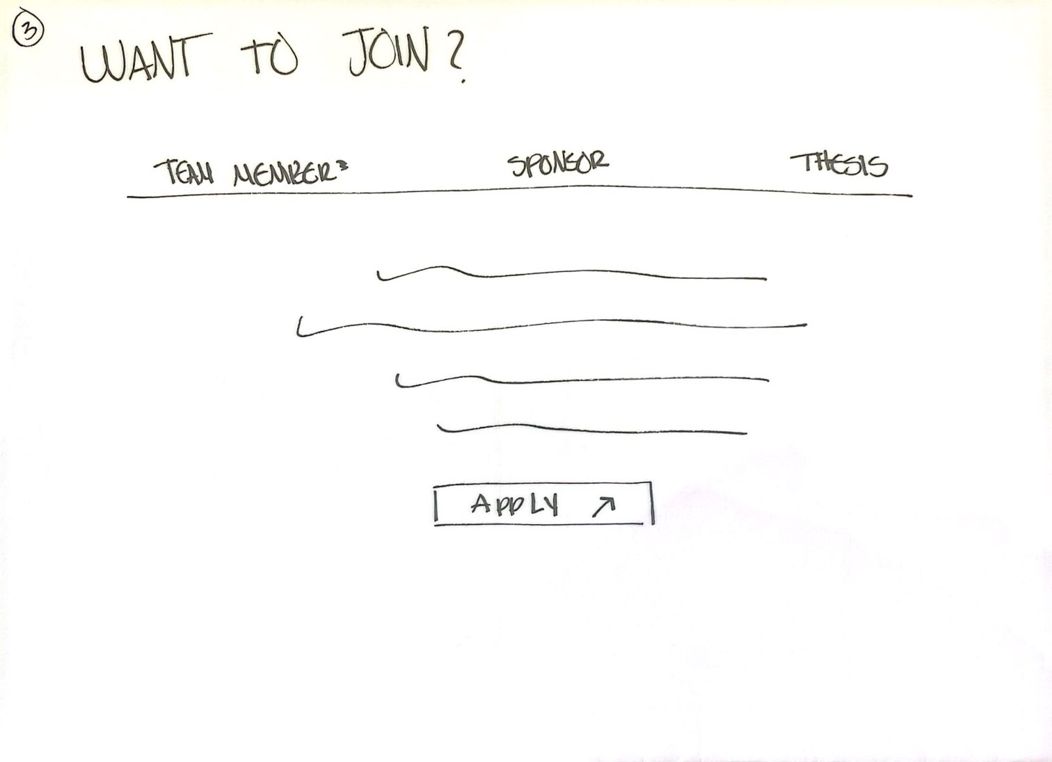
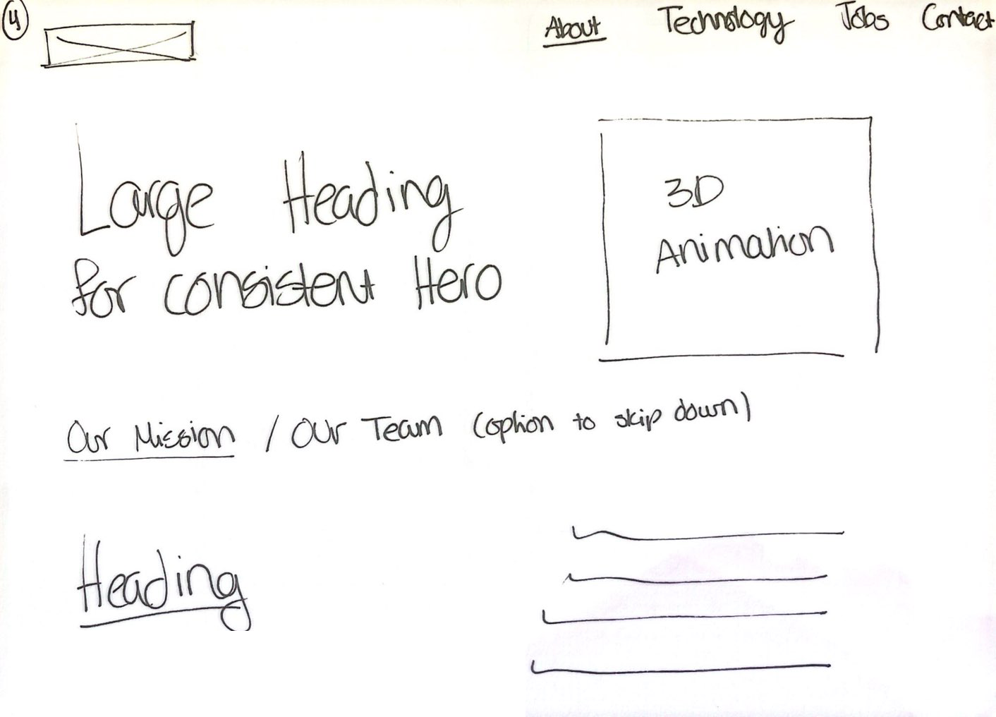
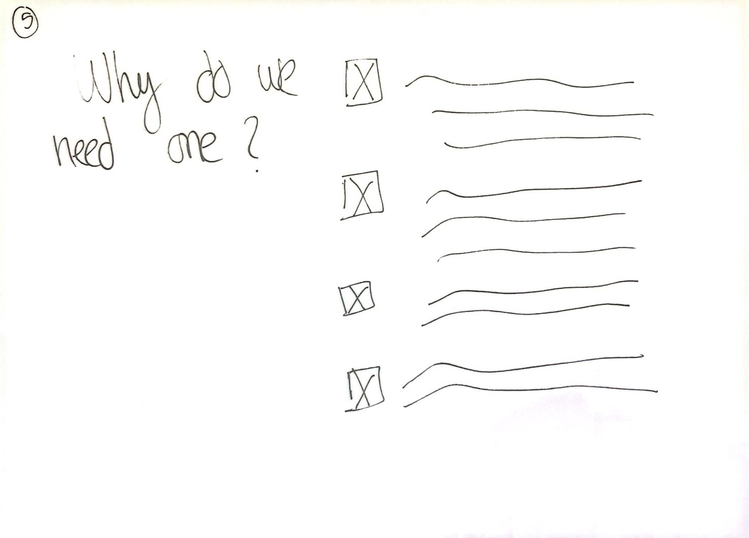
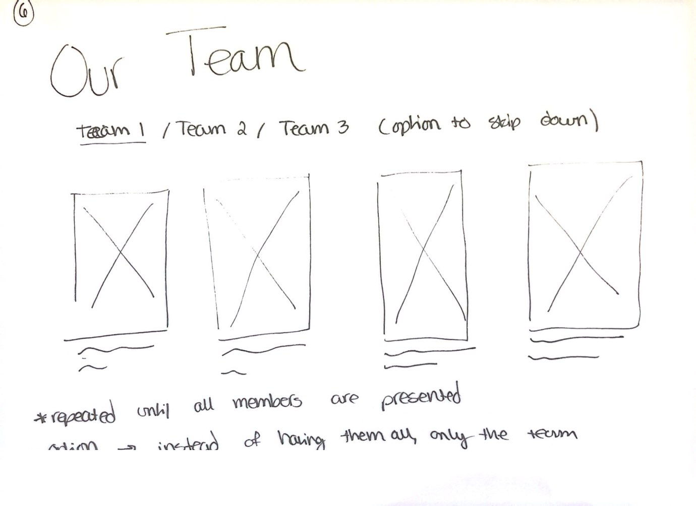
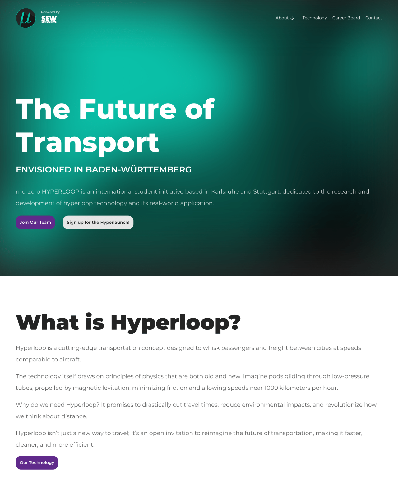
I began sketching with a few concept ideas in mind. The first step was making the navigation clear by limiting the sections found in the header. By making the About section a drop down menu, we can categorize pages like Mission, Team, Sponsors, and Join Us. The next was integrating CTA buttons in the right places, giving users various opportunities to learn more, contact the team, or submit an application.
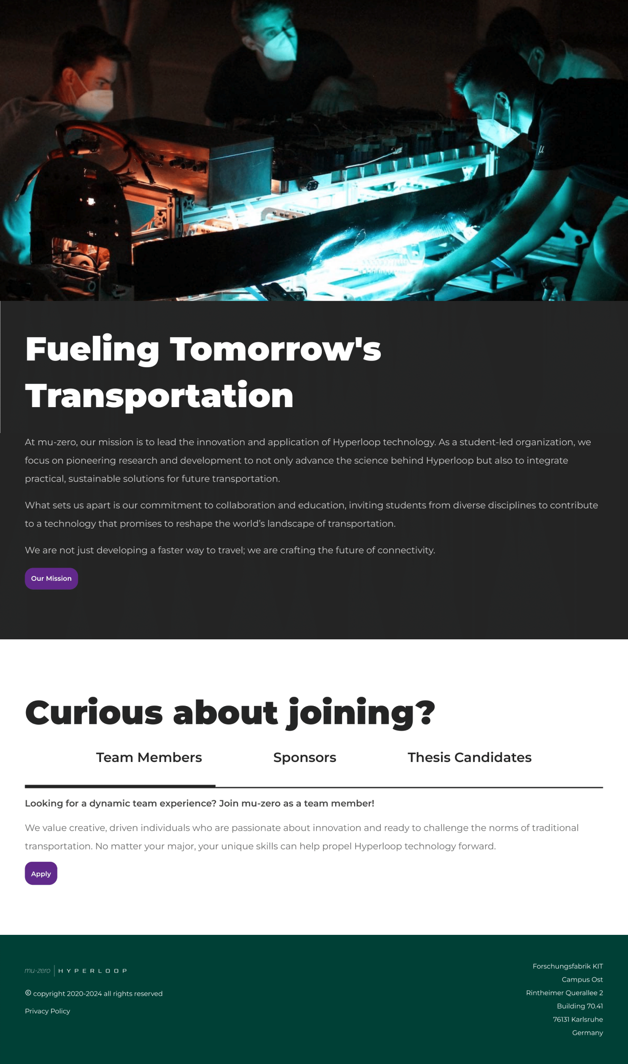
To make the concept accessible, I focused on splitting the content using big and bold headers. Not only does it make the content easy to scroll through and understand, but it also fits the innovative nature of the organisation.
Finally, I wanted to integrate the use of various animations. Considering the key target audience, students, I wanted to increase the interactivity between website and user, and attract them to the overall design, and in turn, the organisation itself.
The Future is Accessible
When inviting a group of people to join you on the path towards a more sustainable future of transport, you need to be sure they understand the process. By leaving the intimidating factor out of the equation, more people will be likely to want to contribute to the cause. For mu-zero’s website, the copy is key. Using friendly yet professional language to outline the organisation’s mission and values made it more inviting, and easy to understand. To shape the future, you need the path towards it to be accessible.
A Close-knit Community of Pioneers
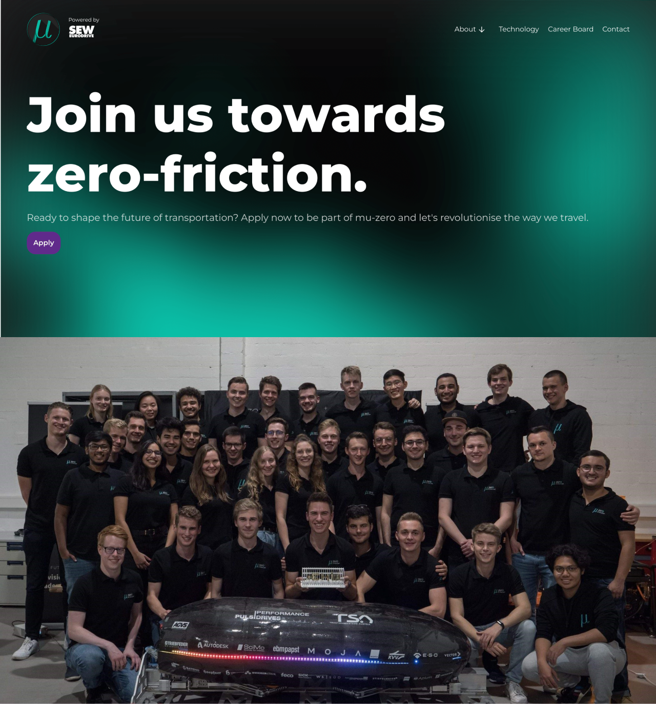
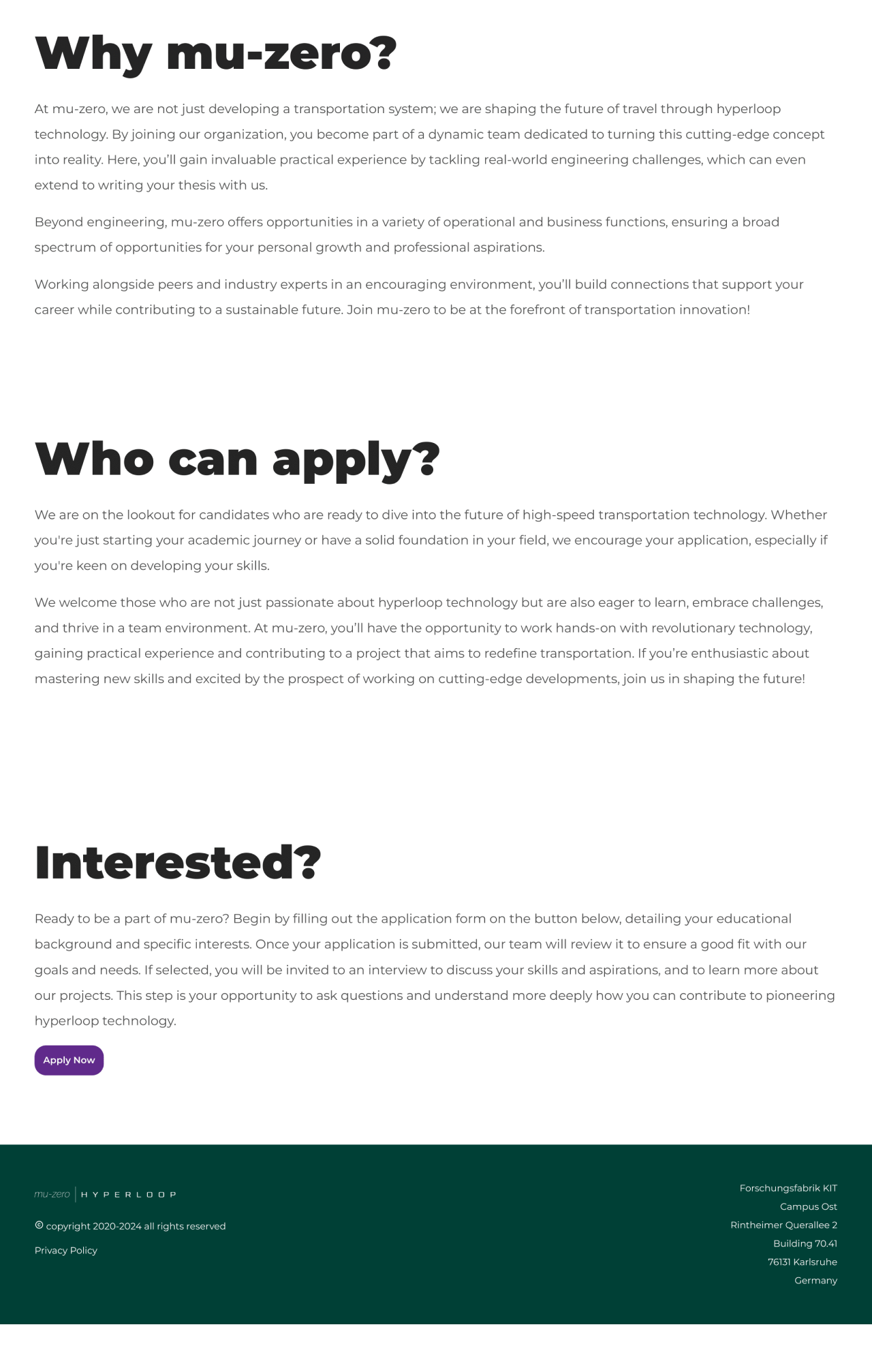
The user research showed that a lot of students apply to join mu-zero as an opportunity to meet new people, and join them in creating something new and exciting, and I wanted to the joining page to represent the close-knit community behind the organisation. The opening line “Join us towards zero-friction.” is encouraging, followed be a team photo, giving the team a face and creating a relationship between them and the user. The rest of the page goes on to explain what mu-zero has to offer, as well as what the next steps for the process are.
Room for Opportunities
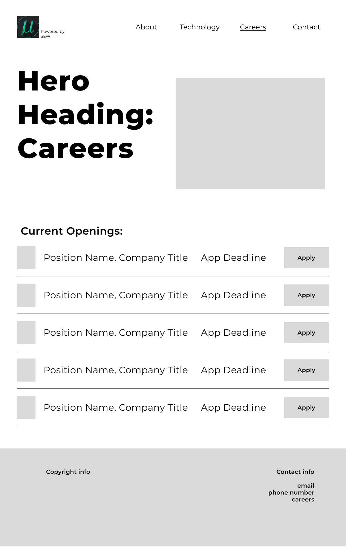
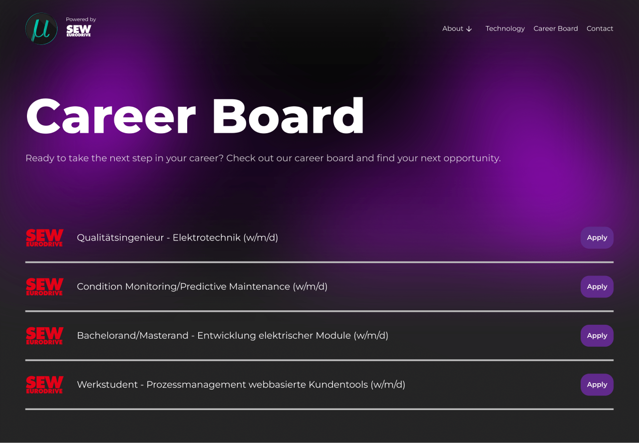
As part of mu-zero’s agreement with their sponsors, the website must include a section for job opportunities. Not only is this a chance for companies to recruit some of the best upcoming talent, but also for students to find companies that can help them succeed in their chosen career field. The page had to be simple, and portray all the needed information, as well as be easy to find.

Results
The website received amazing feedback from the team, and succeeded in making navigation easier, promoting the image of the organisation, and simplify the complex nature of hyperloop technology.
Learnings
This project provided me with an incredible opportunity to learn and test my skills. I had the opportunity to collaborate with a multi-functional team, present my ideas to a new group of people and work to make their vision come true.
As part of the process, I took the opportunity to learn how to use Framer, a no-code development site that gives you complete creative freedom. I advanced my skills in elements such as auto-layout, and learnt how to create various animations in order to take the design to the next level.
Most of all, I learnt how to simplify complex information, and the importance of making a website usable in the recruitment process of a student organisation.
Make sure to check out the full and final product! www.mu-zero.de
