Simplifying Human Resource Management.
UX/UI Case Study
How can an application streamline human resource processes?
Project Scope
My Role:
Competitive Analysis
User Research
Journey Mapping
Wireframing
Design
Client:
INSAN HRMS is a start-up company based in Amman, Jordan. They provide a cloud-based HR system and aim to revolutionize the HR process, bringing users a significant increase in efficiency and effectiveness.
Timeline:
January 2024-March 2024
Main tool used:
Figma
Brief:
To create an app where employees can access all HR-related matters (incl. leave balances, statements, and requests), and managers can keep track of their reports information.
01 Competitive Analysis
Key Objective: To provide a high performance, yet fairly priced and seamless HCIS.
Comprehensive system.
Strong presence in the market.
Many features available.
Strengths:
Did not update seamlessly throughout the years.
Low usability.
Cluttered interface.
Weaknesses:
Longstanding presence in the market.
Can benefit from low pricing.
Opportunities:
Constant technological changes they cannot keep up with.
Increased competitors with newer technology and better usability.
Threats:
UX Analysis:
Usability: Not very user-friendly, app contains many errors.
Layout: The app has a cluttered interface.
Navigation: Difficult to find the required information.
Compatibility: The desktop versions seems to not work properly.
Key Objective: To allow users to reach a state of “zen” through the app usage.
Localized to the MENA market.
Many features available.
Strengths:
Interface is difficult to use.
Low usability.
Contains a lot of bugs.
Weaknesses:
Presence in the Saudi Arabian market.
Has good integration with Saudi government laws.
Opportunities:
Small presence in Jordan.
Competitors with new technology and more usable interfaces.
Threats:
UX Analysis:
Usability: Users complain of difficulty of use, as well as constant errors.
Navigation: Difficult to find the required information.
Compatibility: Browser-based and is compatible on all devices.
Key Findings:
The existing applications have all the right functions, but they are difficult to use and do not take user experience into consideration. Their strength lies in their longstanding presence in the market.
Who?
Employees who would like to manage their HR related matters on one easy to use and simple platform.
Managers who would like to view all their raports information in one place.
02 Setting Key Objectives
Why?
The app offers convenience, efficiency, transparency and organization to the HR system.
What?
To have all HR-related options in one simple and easy to use interface, this includes submitting leaves & requests, balances, overtime, payslips and many more.
How?
The app allows users to easily access all given features, whether it is submitting forms to the HR department, or viewing personal information.
Where?
The app can be used anywhere, whether at home or in the office, allowing the user to complete any tasks required regardless of their nature of work, ensuring accessibility.
When?
The app can be used whenever they require any HR-related information, in addition to being able to clock in and out on the app, making it a hassle-free task.
03 Conducting User Interviews
Key Findings:
“I want to limit my interactions with the HR managers and find all the information I need online”
“I often struggle with delays from the department, and I need to constantly visit them to get my request approved”
“There isn’t enough transparency, and I struggle to keep track of all the information”
04 Creating User Personas
User personas helped in the personification of common frustrations and goals. When designing the initial solutions, the user personas provided a framework to how usable they would be, and what might make them even better.
Name: George
Age: 35
Location: Amman, Jordan
Position: Mid-level employee
Frustrations:
Experiences constant delays with HR, struggles to get replies about simple needs such as payslips.
Goals:
To have their personal information available quickly and easily.
To be able to request leaves online.
Name: Lina
Age: 25
Location: Amman, Jordan
Position: Entry-level employee
Frustrations:
Struggles with forgotten leave requests. Having to constantly follow up with the HR department in person.
Goals:
To have their leave requests and history/balance available on a single platform.
Name: Rula
Age: 47
Location: Amman, Jordan
Position: Senior Manager
Frustrations:
Struggles to form schedules for her teams while considering each member’s schedule.
Goals:
To have access to her team member’s information on one simple and easy to use platform, ensuring efficiency in planning and delegating.
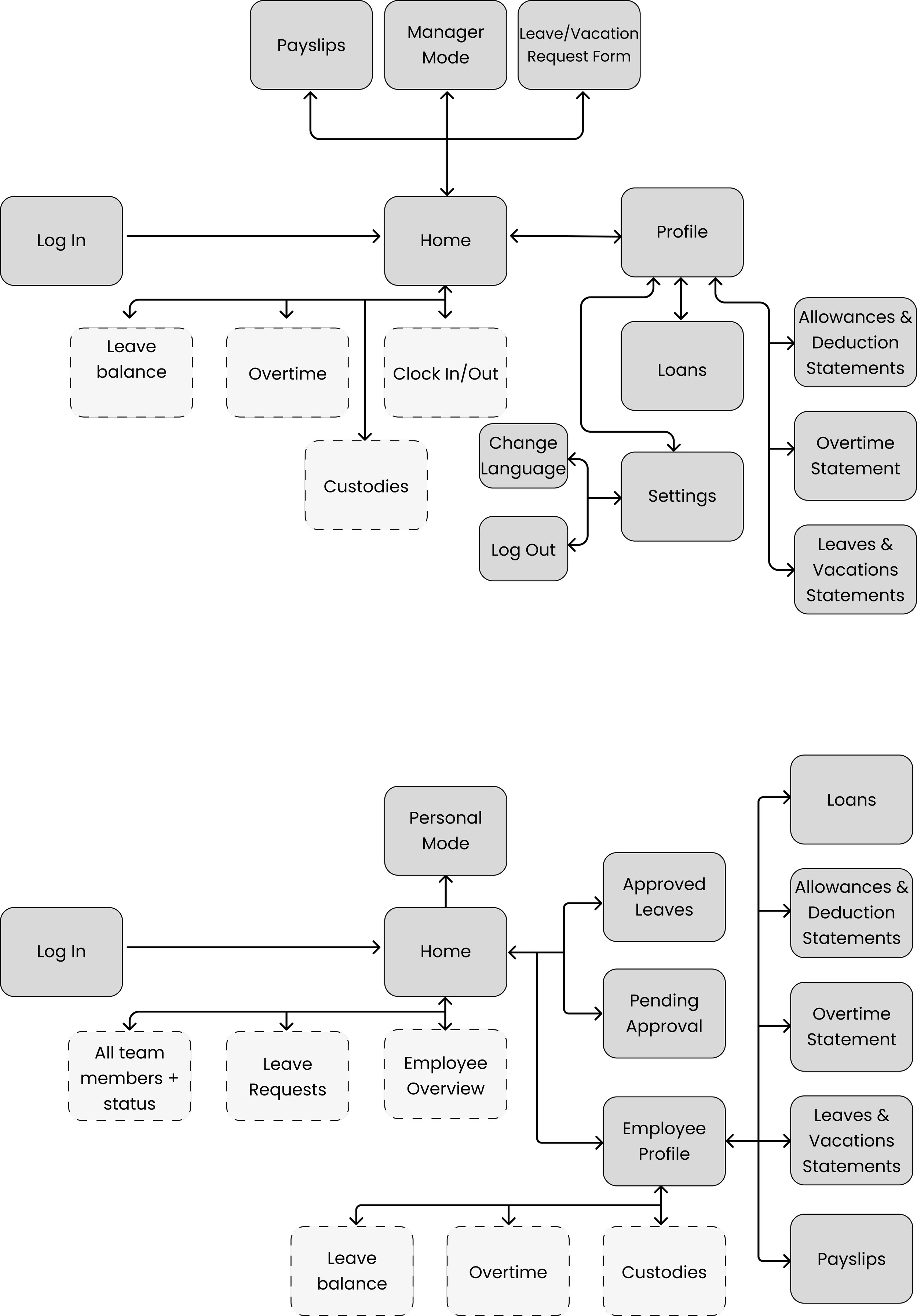
05 Mapping the User Journey
Personal Mode:
Manager Mode:
06 Developing Ideas
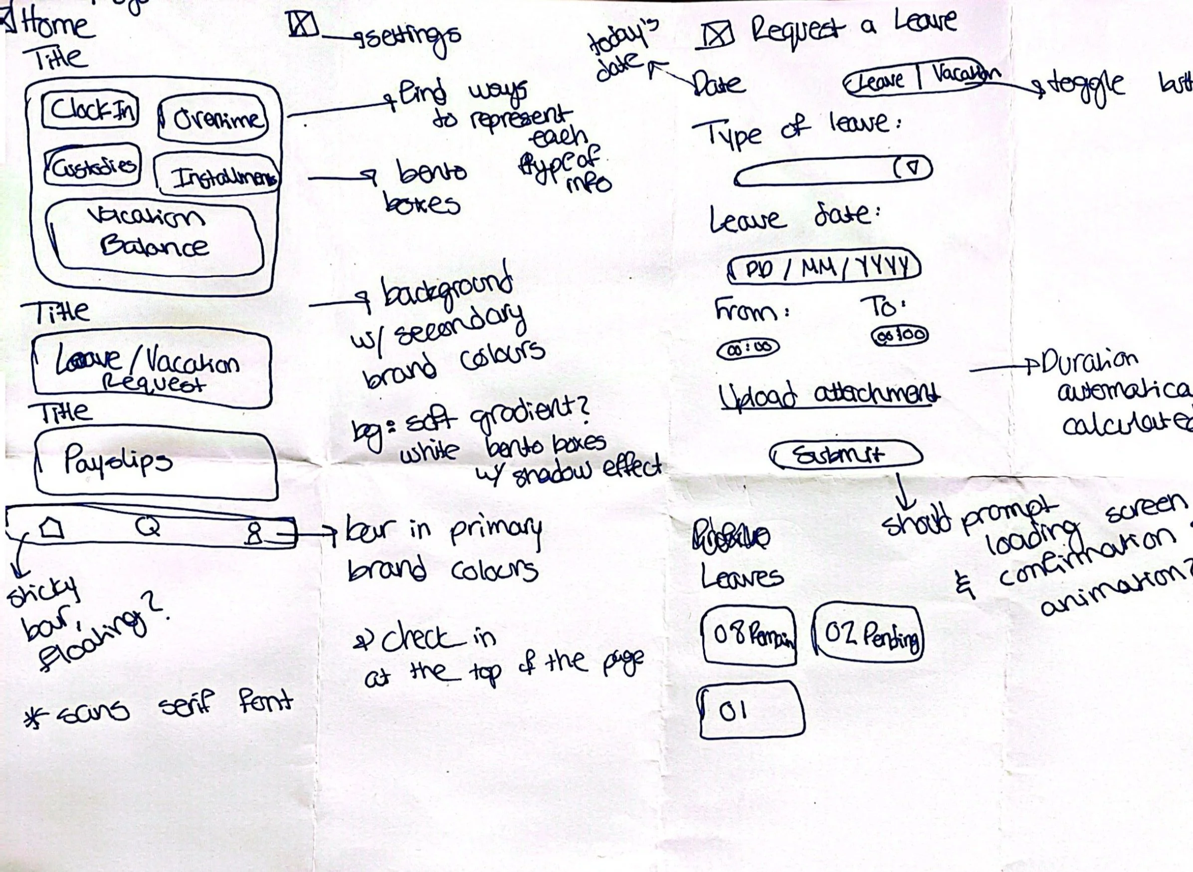
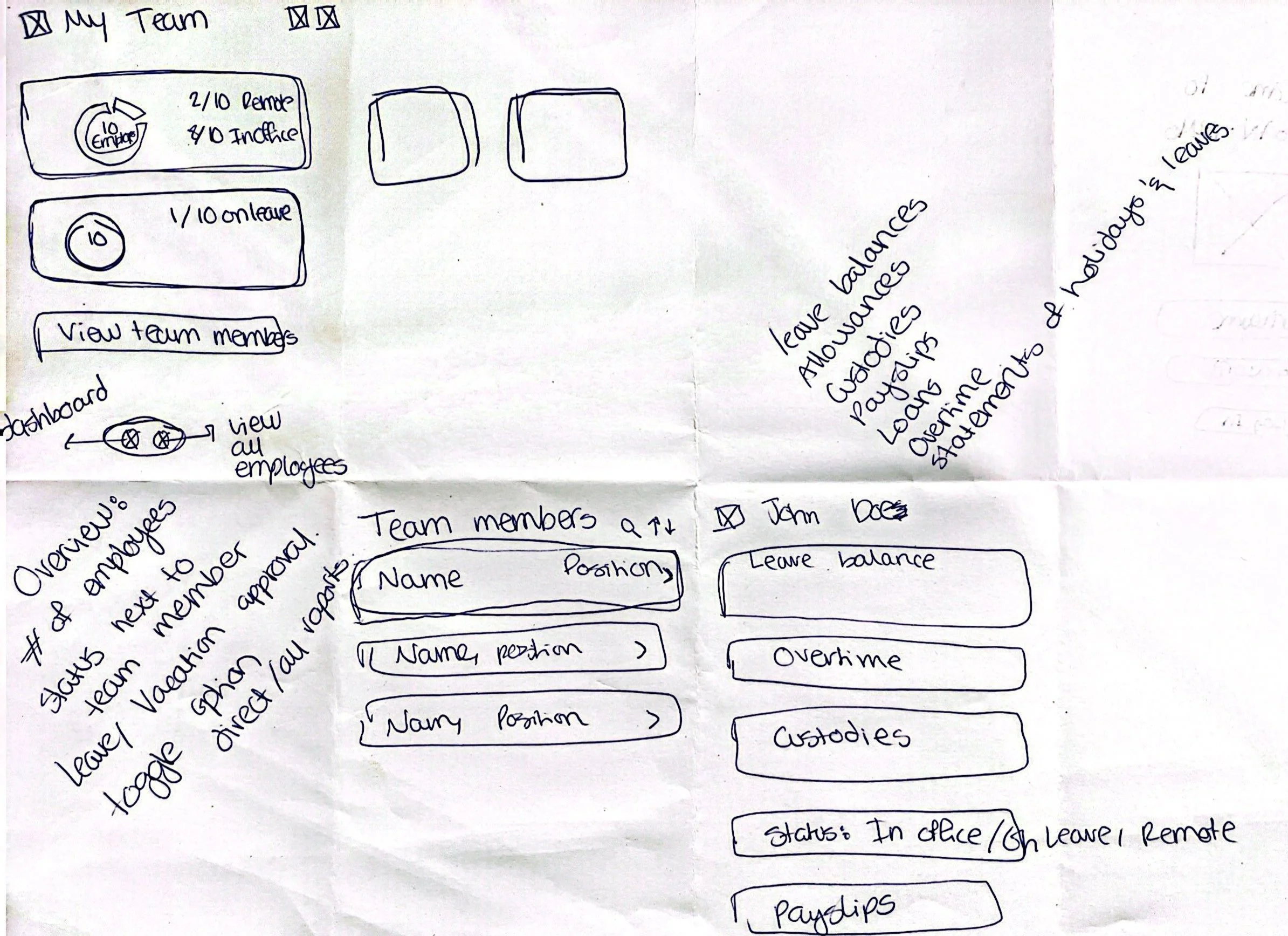
To kick off the user interface design process, I start with rapid prototyping, sketching all my ideas out and slowly bringing together a cohesive design.
07 User Interface Design
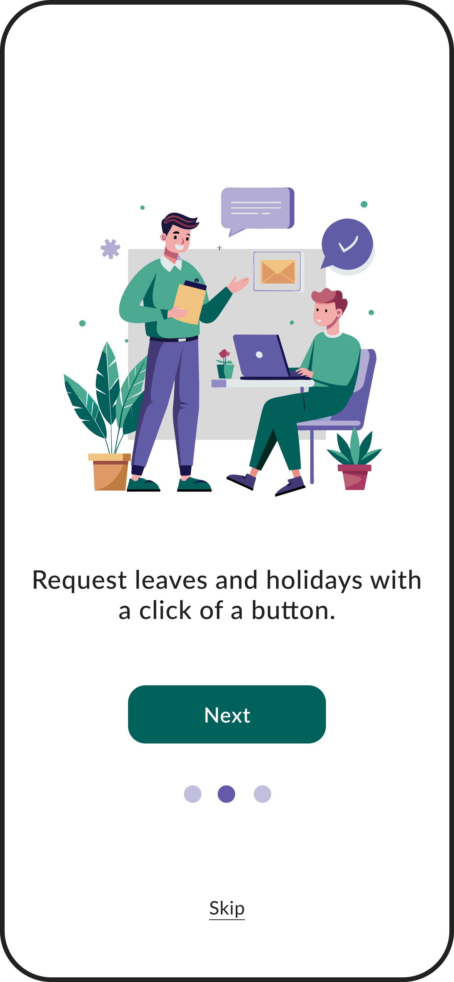
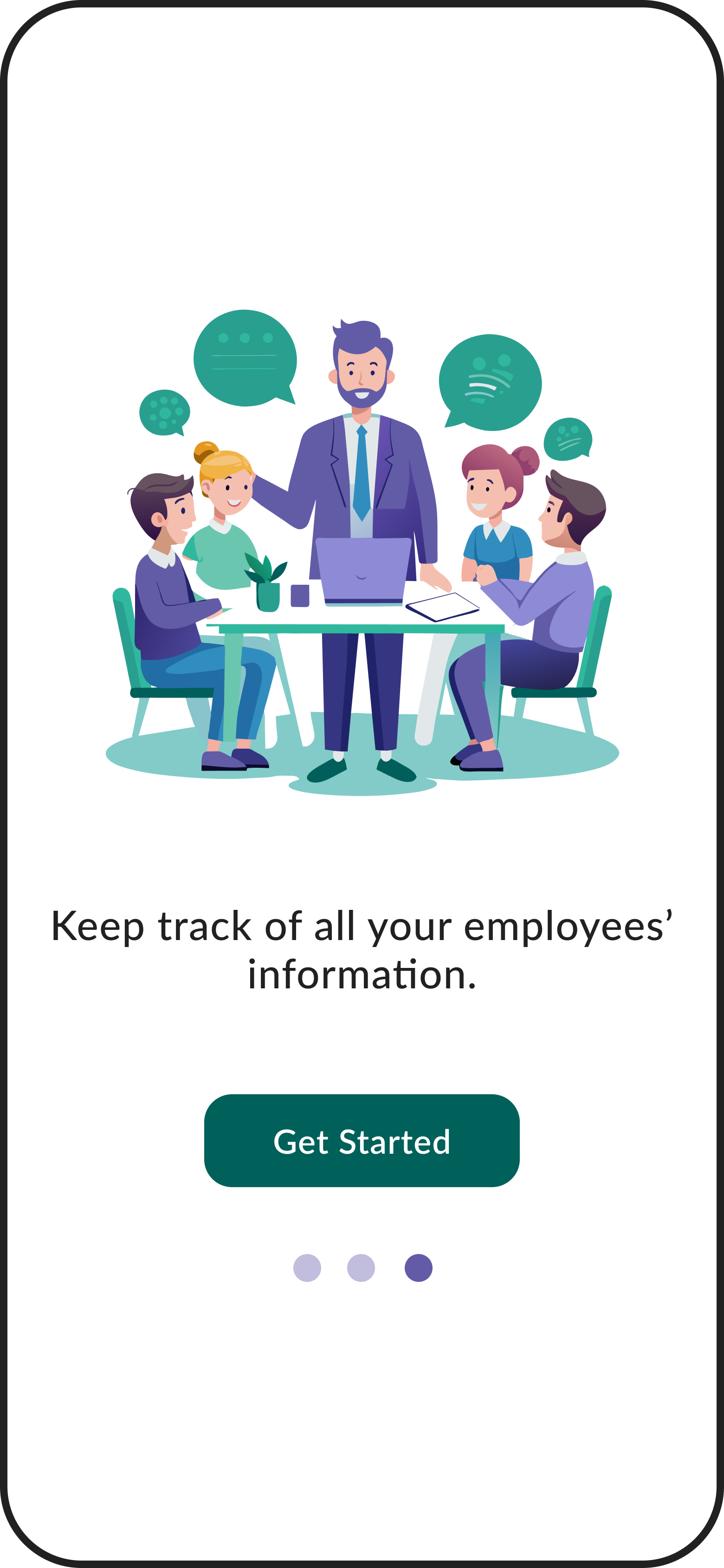
Onboarding
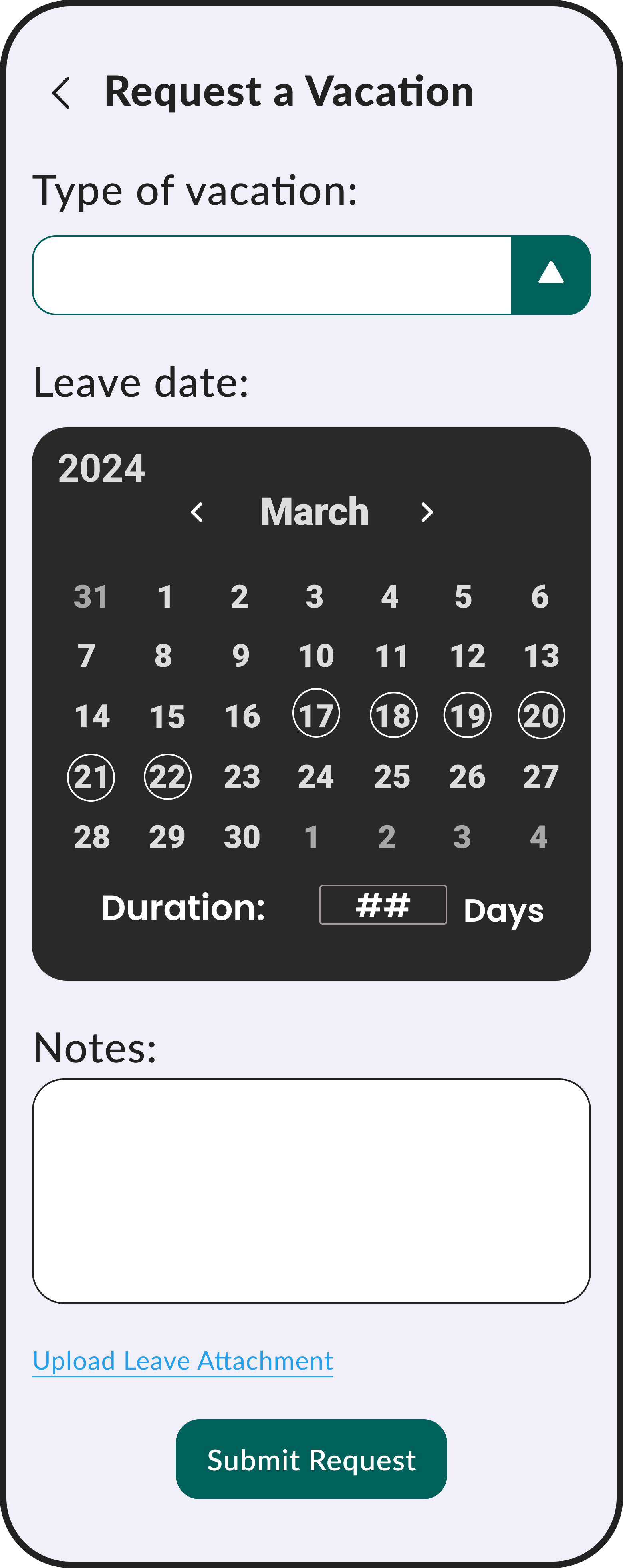
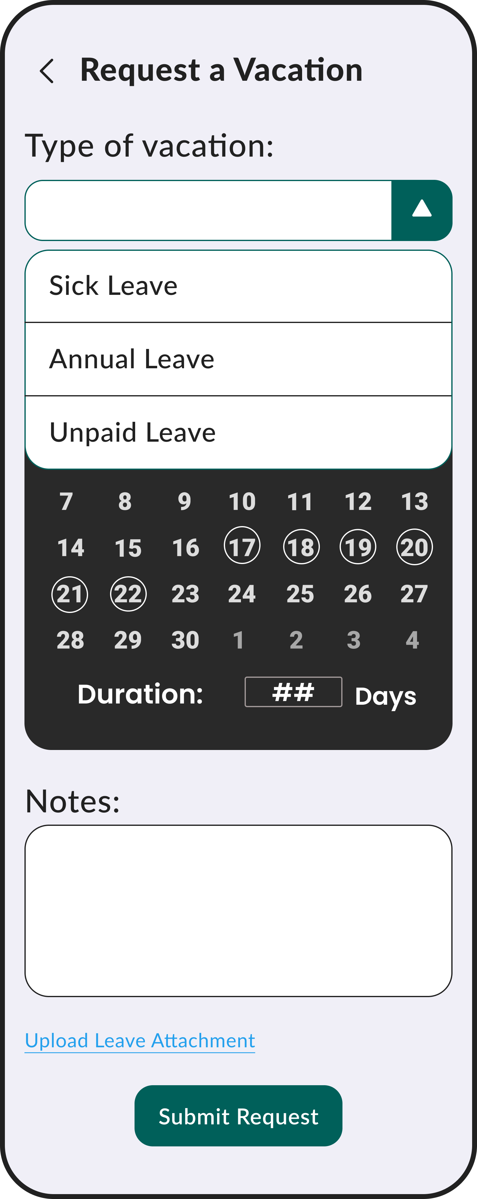
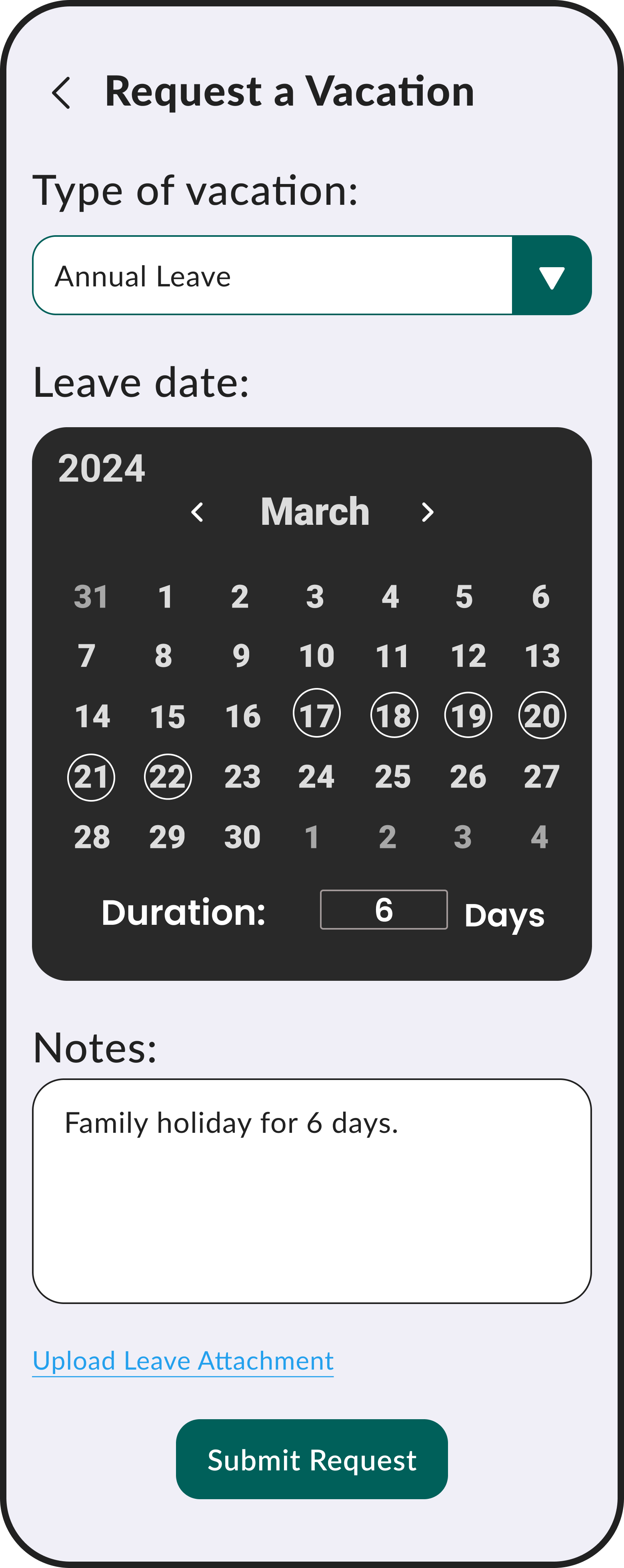
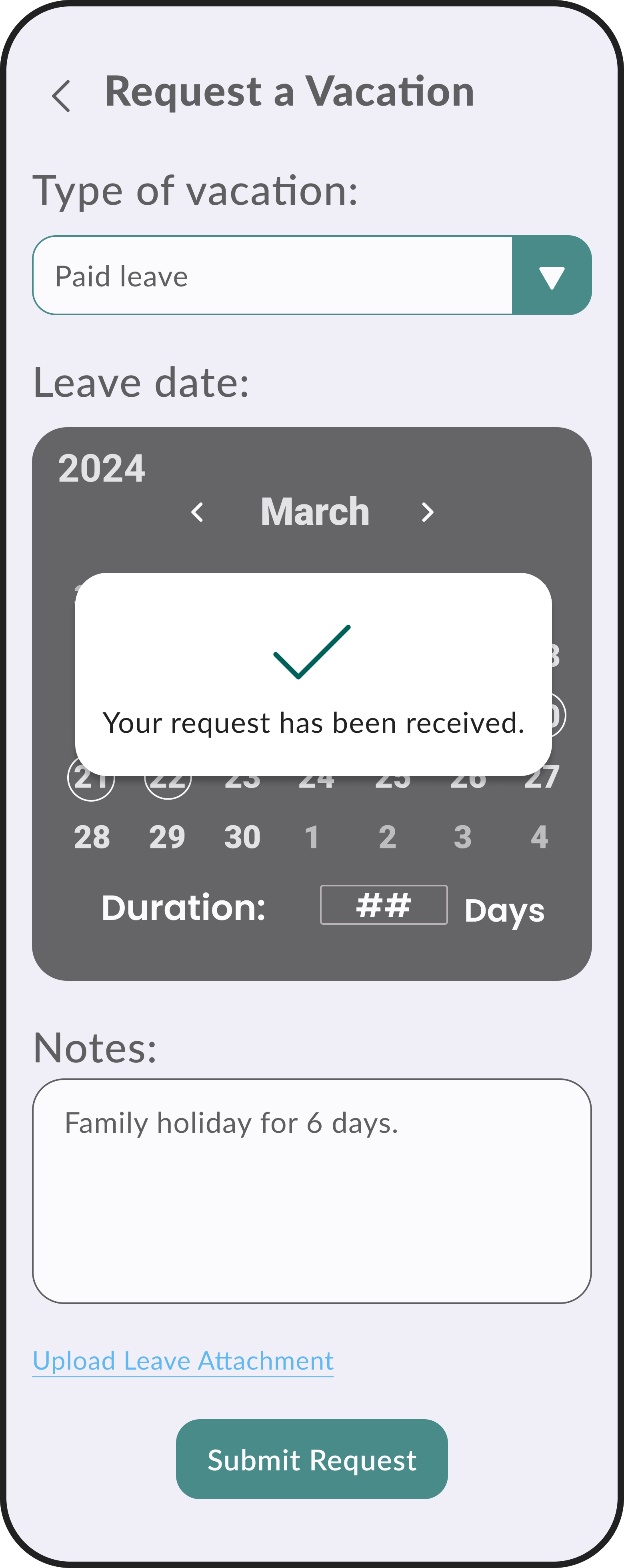
Request a Vacation
Elements are organized according to level of importance as expressed by potential users.
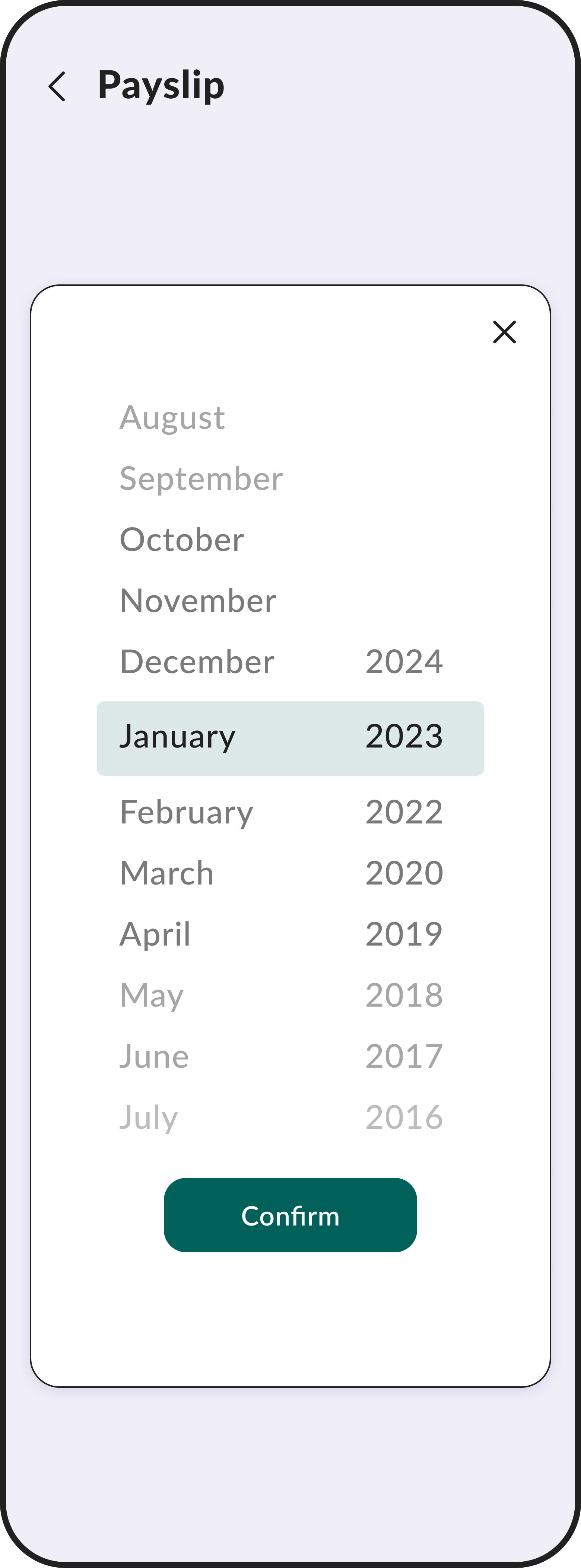
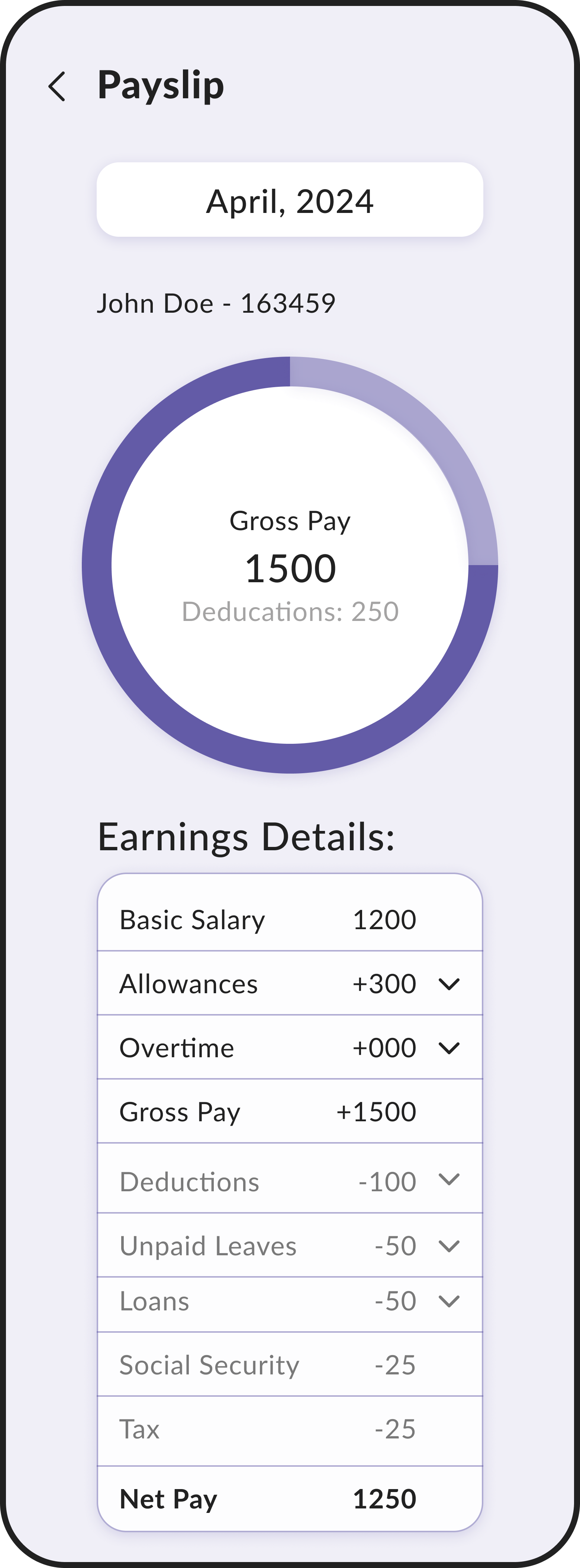
View My Payslip
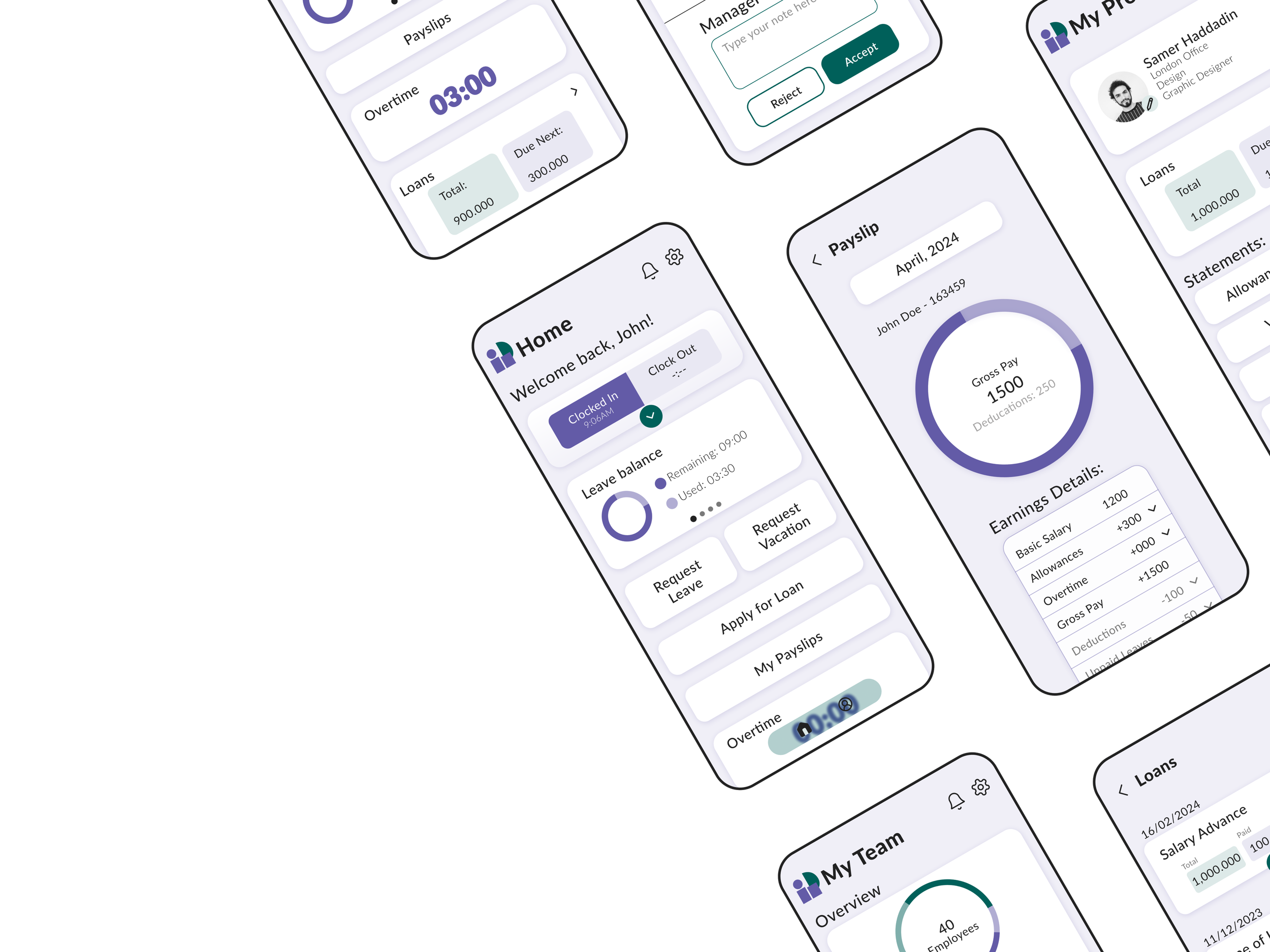
A graphic representation of the payslip allows for better understanding and limits frustrations.
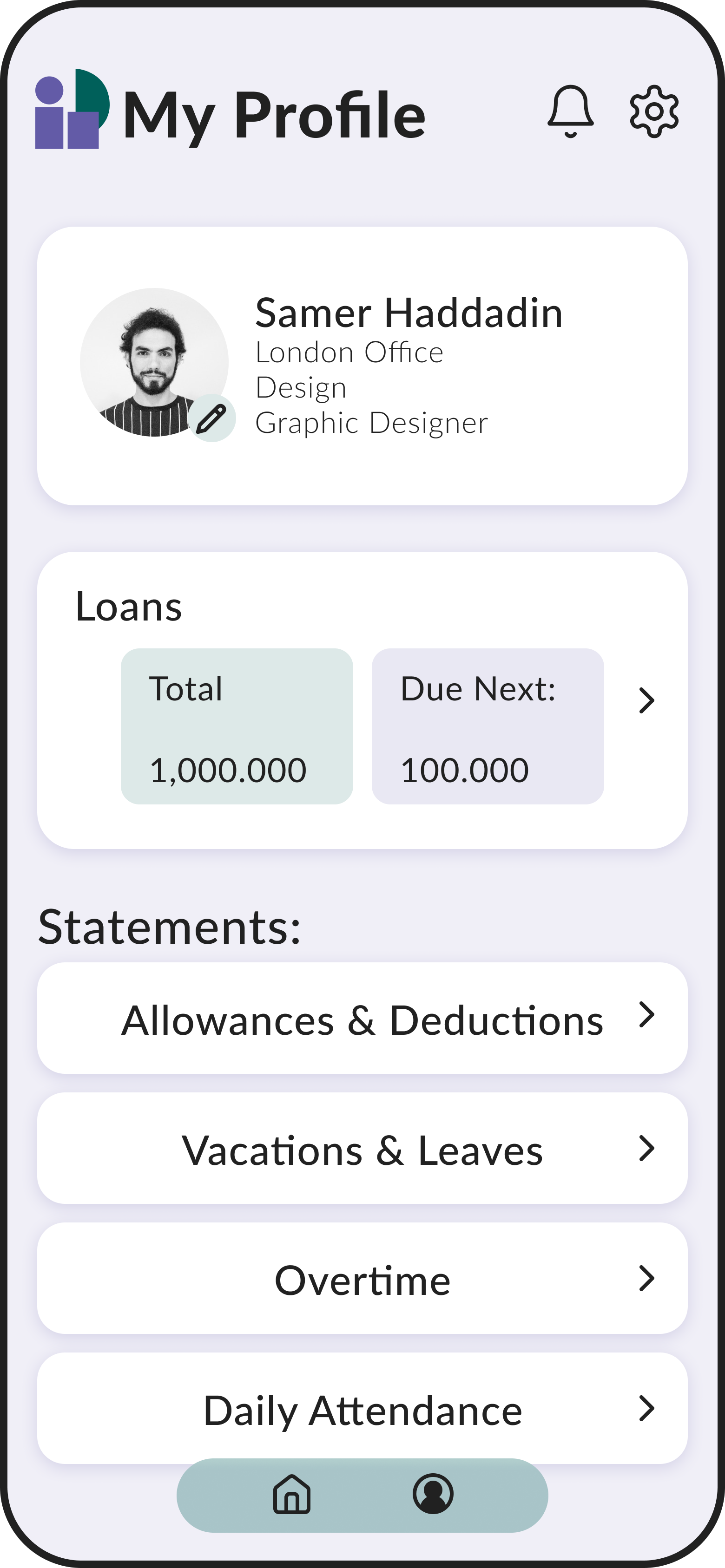
View My Loans
Users expressed concern about the privacy of their loans, wanting them to be hidden. Placing them on the profile page rather than the home page allows for an extra level of privacy.
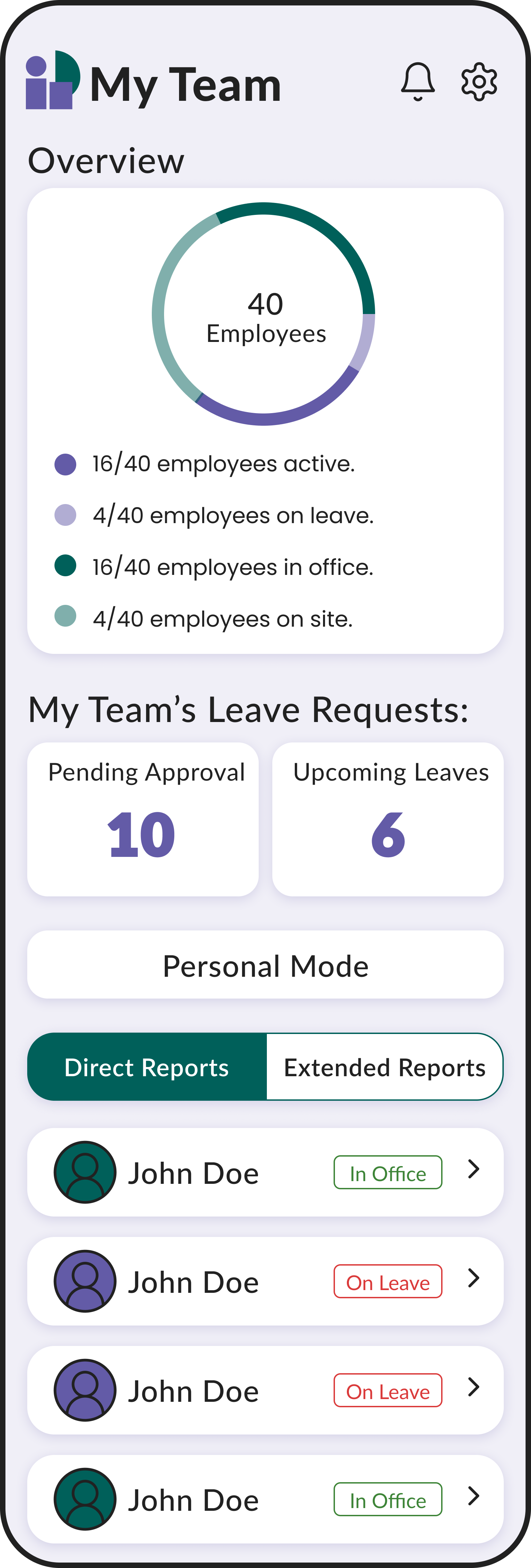
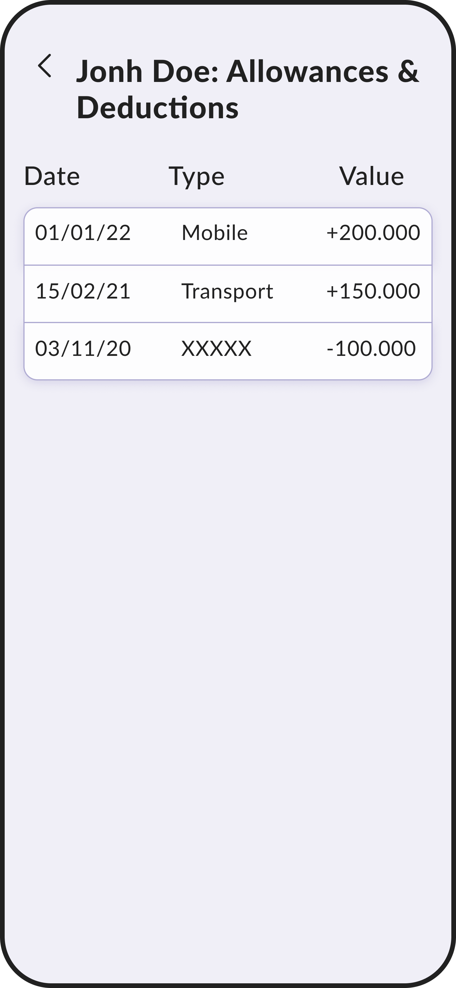
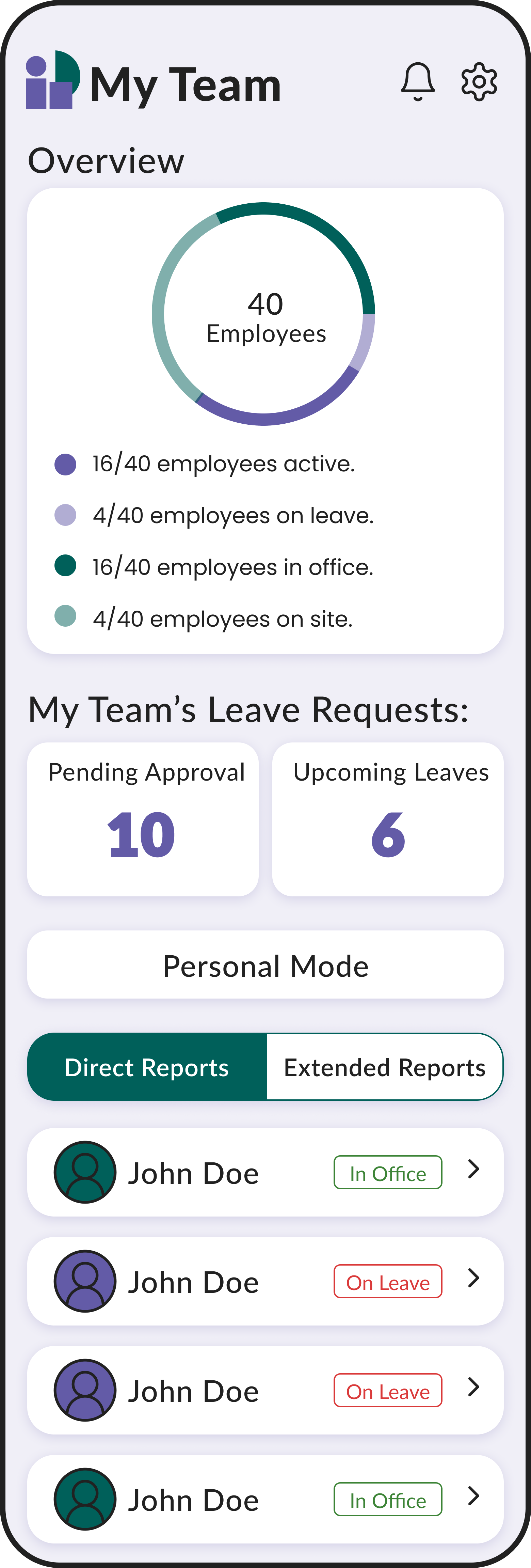
View My Employee’s Statements
The overview is based on the most relevant information according to potential users.
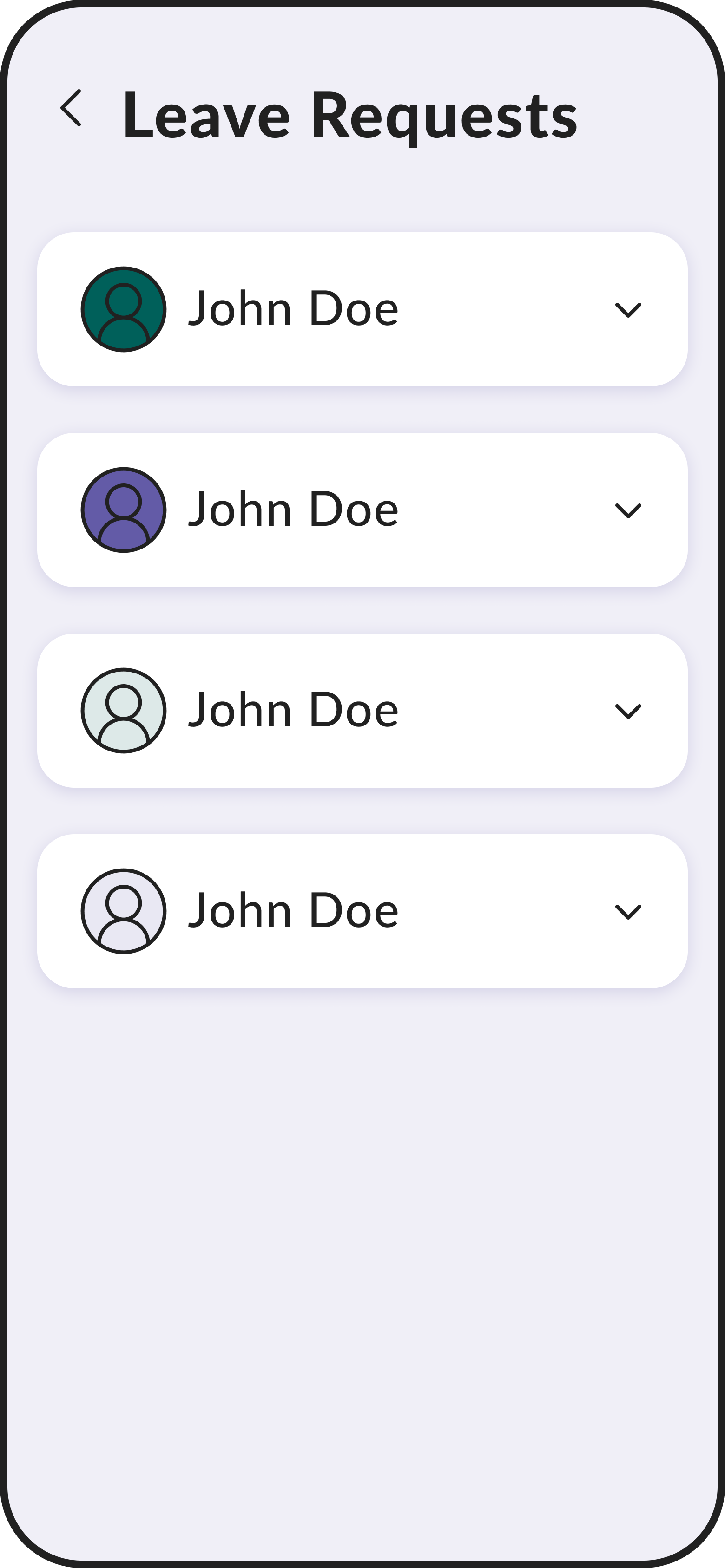
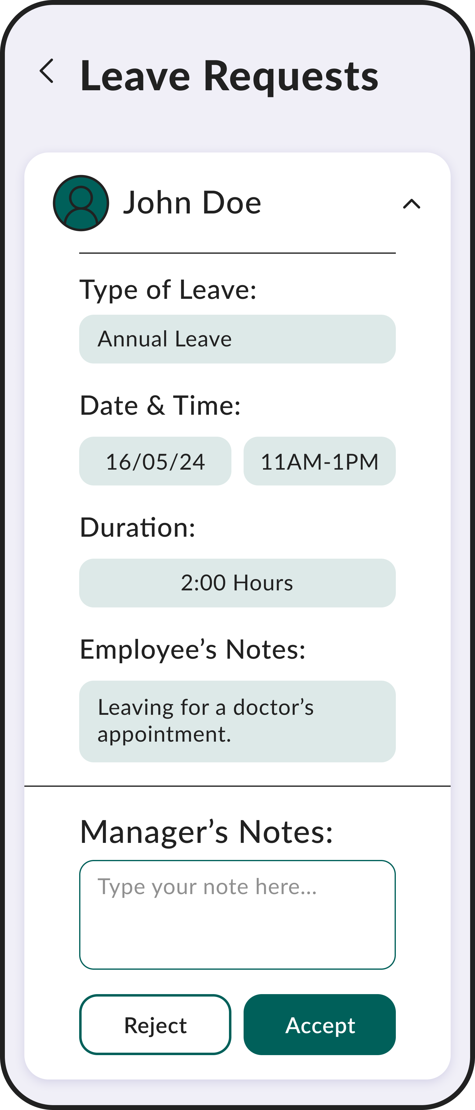
Approve My Employee’s Leave Request
Users expressed that approving their employee’s leaves was their main goal, as a result it is placed at the top of the page.
To ensure usability, managers are able to view an image of the employee before expanding the block and approving/rejecting the leave.
08 Style Guide
Colour Palette: Following the existing brand guidelines
Typography:
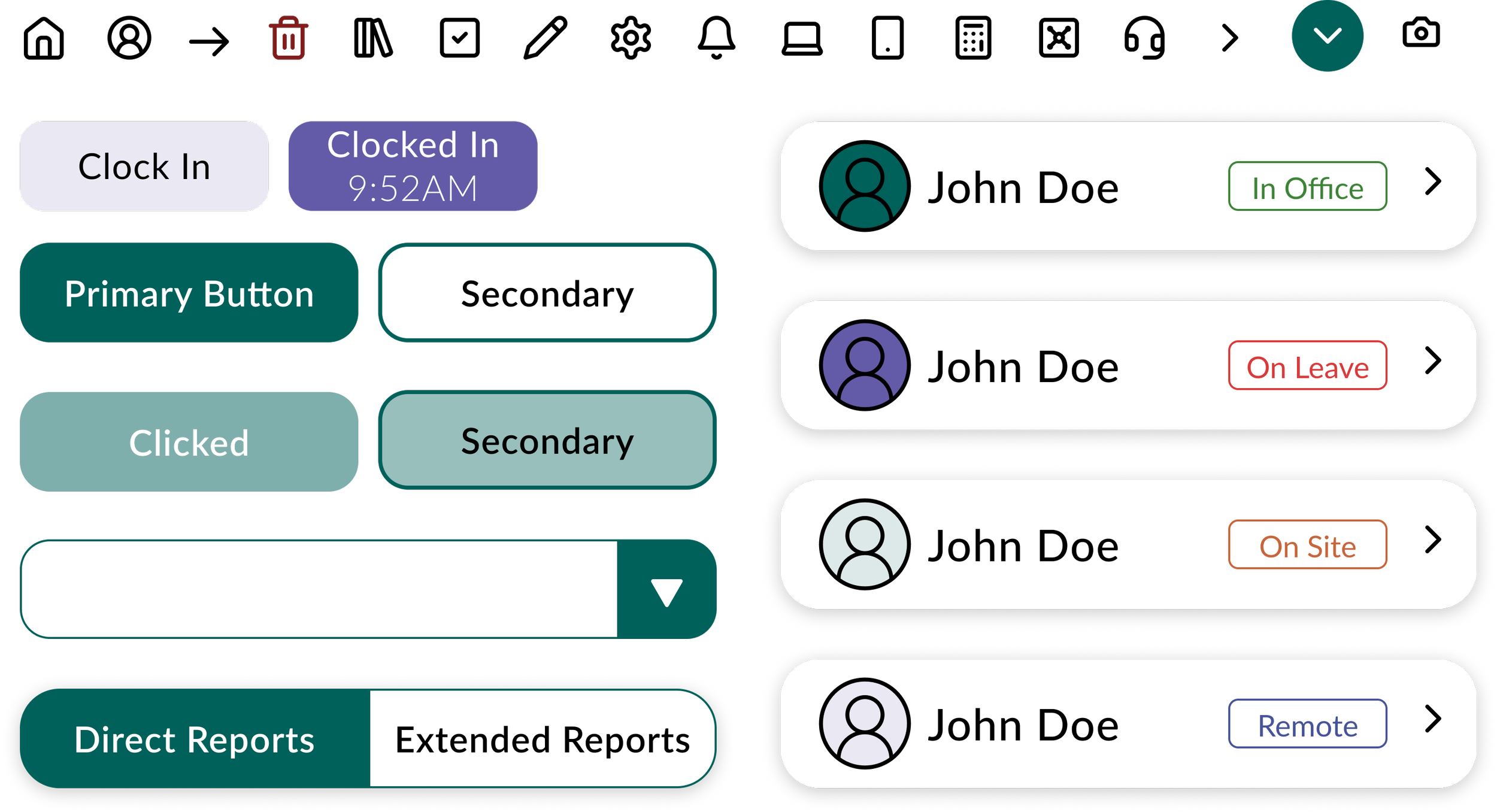
UI Elements:
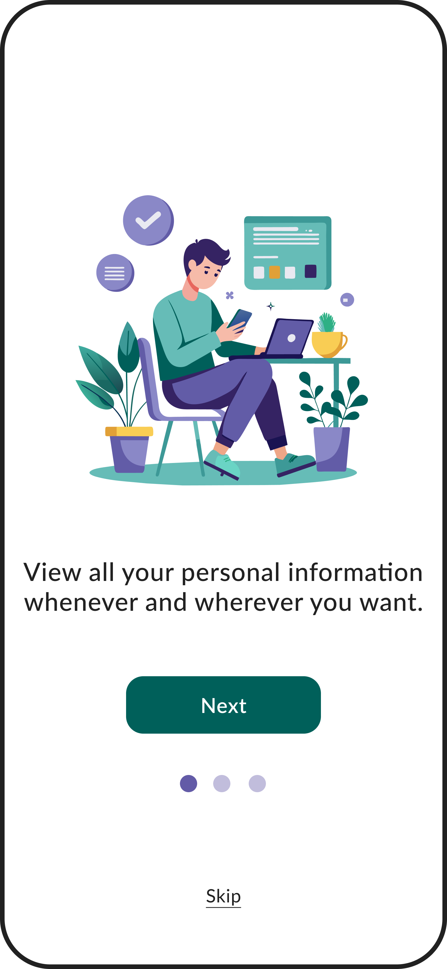
Illustrations: To provide a friendly and welcoming onboarding experience.
The Result
The INSAN HRMS Application allows employees to, at a glance, view their leave balances, custodies, and overtime. They can clock in and out with a simple button, and view more detailed and personal information through their profile. Similarly, managers can find a quick overview of their subordinates, approve leaves and view the status of each one of their employees in a matter of seconds. The efficiency of this app will streamline the HR processes of the company, allow for transparency and relieve employees of common frustrations.
